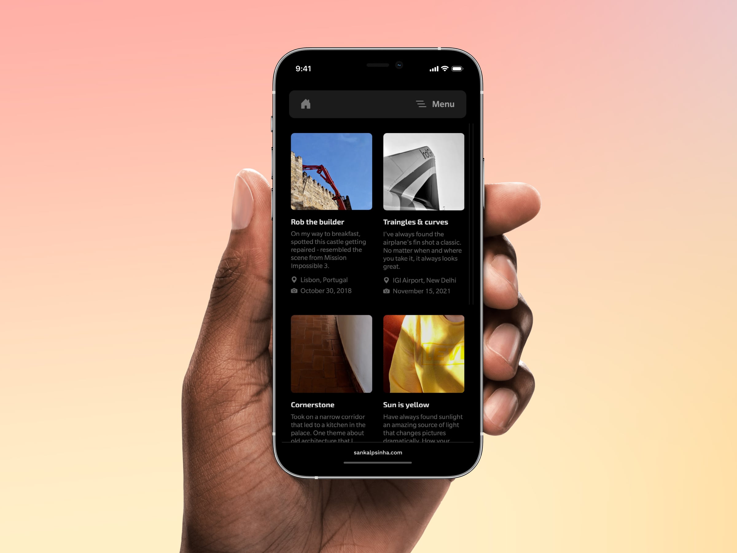
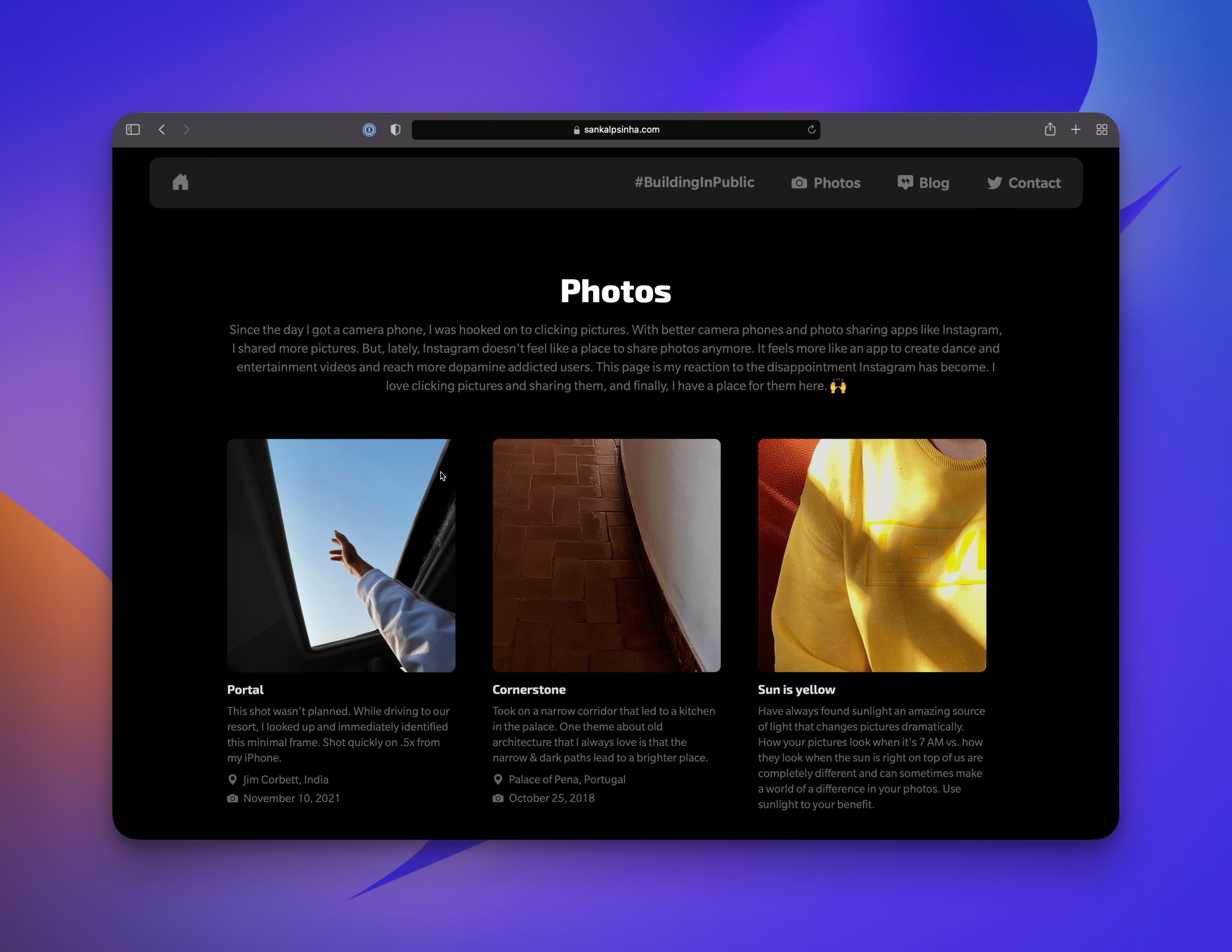
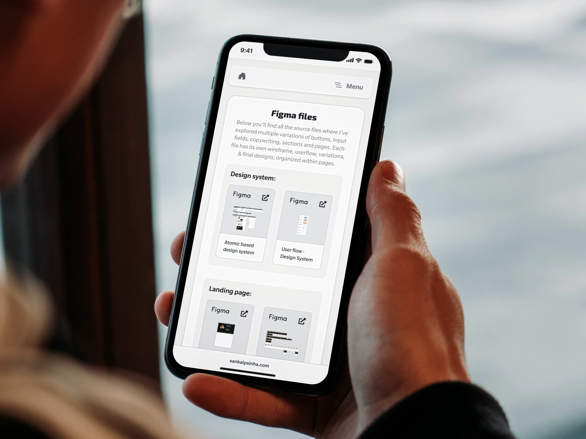
Screenshots from a parallel UI-niverse
If we're connected on any social platform, you'll quickly learn my passion for sharing my work online. Be it my thoughts on a
topic, my writing, what I am designing, what photos I am clicking, or anything else - I share whatever's on my mind. To give my
design work the same treatment and a permanent home on the internet (similar to my photos via a photo page),
I'll be cataloguing my favorite design work here instead of Dribbble.
If we're connected on any social platform, you'll quickly learn my passion for sharing my work online. Be it my thoughts on a topic, my writing, what I am designing, what photos I am clicking, or anything else - I share whatever's on my mind. To give my design work the same treatment and a permanent home on the internet (similar to my photos via a photo page), I'll be cataloguing my favorite design work here instead of Dribbble.
Ben Novak decides your fate
NextDoor.Company
Now when you sign up to NextDoor.Company, Ben Novak personally checks your payment status and decides your fate for the app.
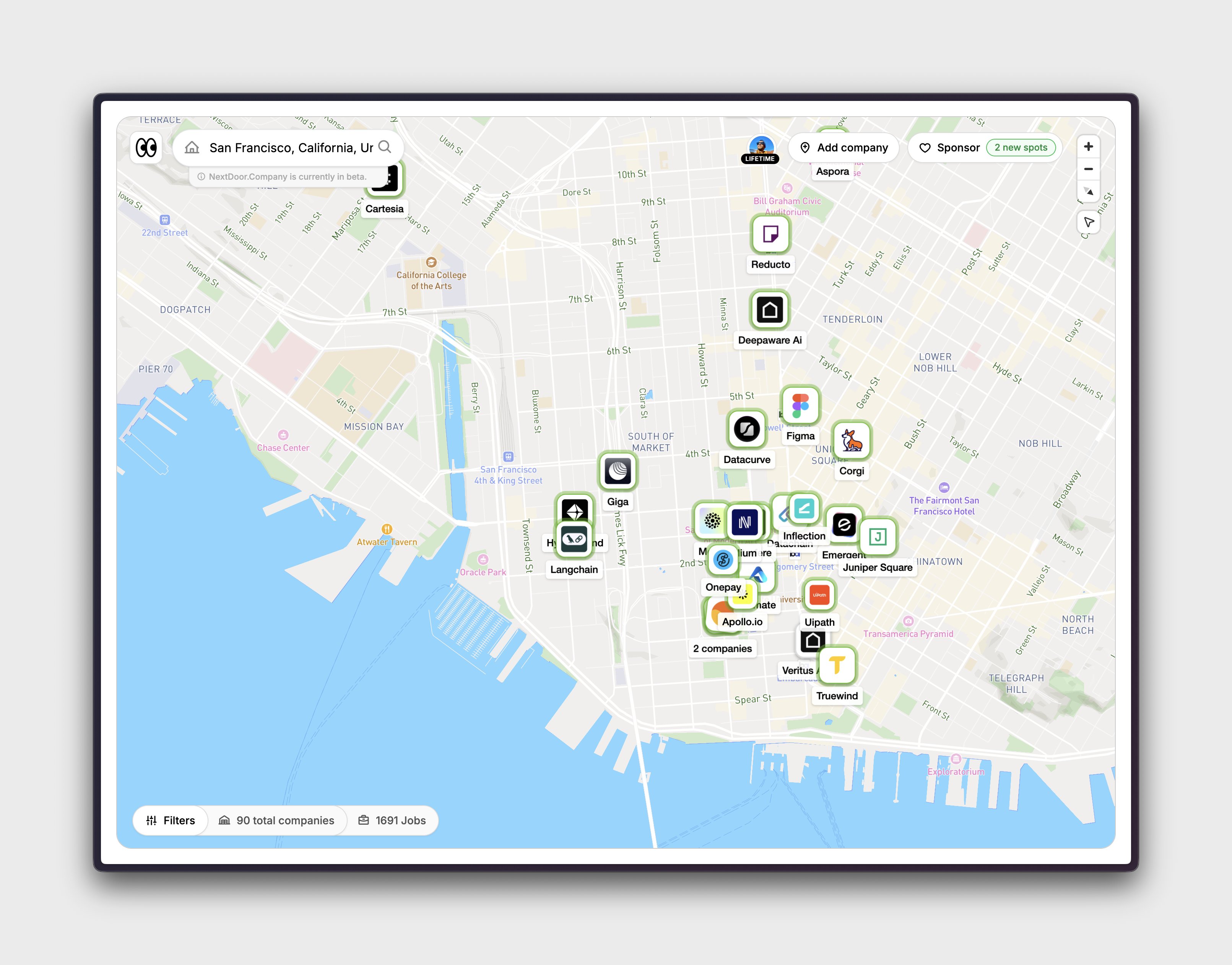
Smooth city navigation on map
NextDoor.Company
Made moving between cities smooth on the map. Exploring startups hiring actively has never been this fun! Shipping freemium access plan next week.
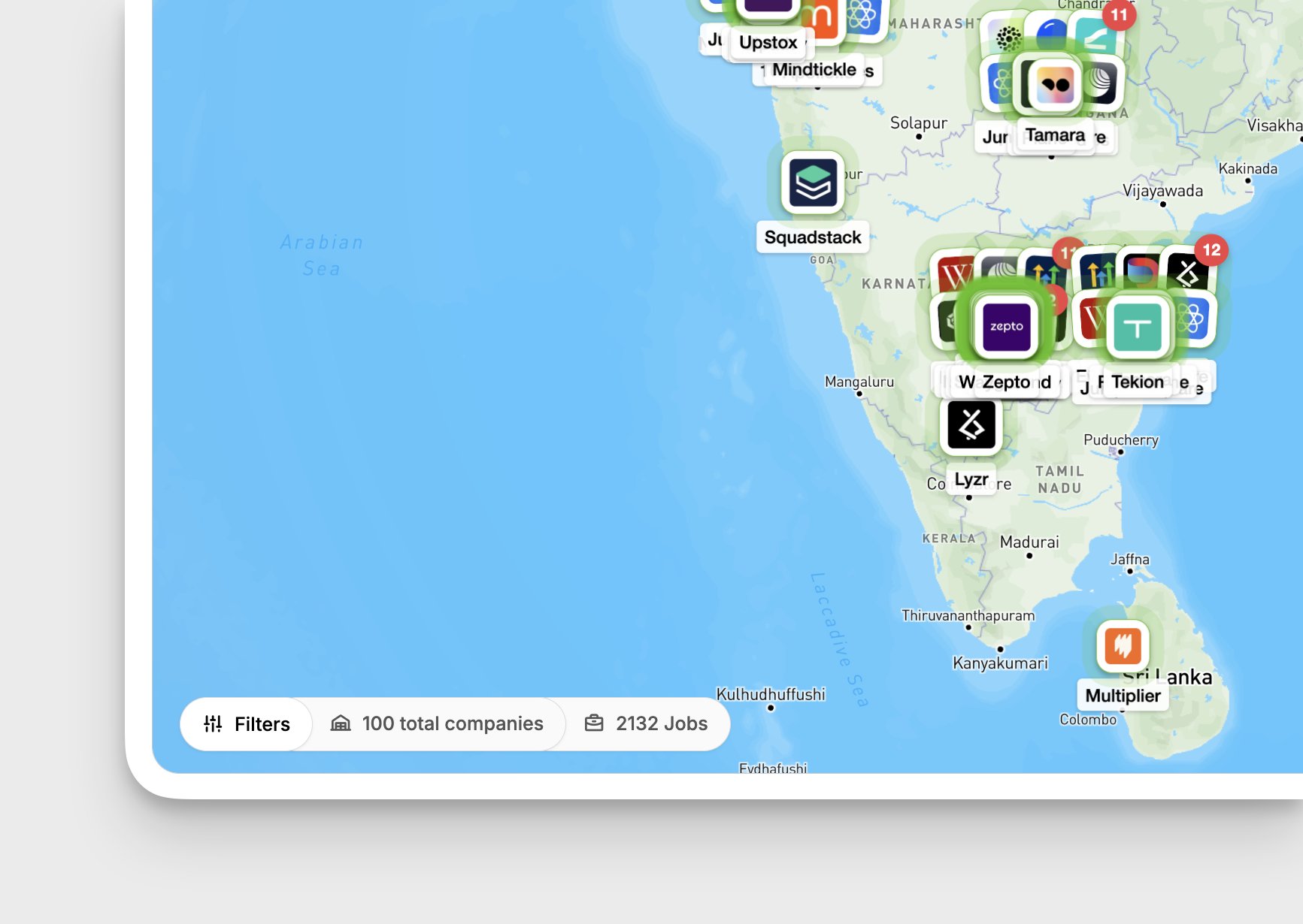
100 handpicked startups milestone
NextDoor.Company
Another milestone for NextDoor.Company. The platform now has 100 handpicked startups hiring actively. I've taken my time to ensure the company intelligence is absolutely accurate. This includes founder details, brief up-to-date description about the org, funding details, investor list, hiring locations, accurate work mode, and many other small details that job seekers go to 10 plus platform to find today. Been 2 months doing this and has been absolute fun building this. The scope here is moon and beyond. Can't even put in the words about my love this problem statement and the fun I am having. I am realizing my mission with NextDoor.Company. It's about making job discovery super fun and insightful at the same time for a million plus around the world. I know it's a heavy weight title to make it work at that scale and with such high expectations. But I think that's what cool about this. That it's crazy ambitious. I am going to have so fun cracking this in the coming weeks, months, and a year and more. This couldn't have been possible without the 100 plus paid users who got the early access and the ones who're choosing a better way to explore opportunities every day. I'll make it worth your time. I promise! More updates soon. Back to building.
Software should be fun
NextDoor.Company
Closer look at the interaction of startup markers when they are clubbed together on @nextdoorcohq. Spend quite a bit perfecting the interaction here. I know I know, I shouldn't have spent this time on interactions when I am THE FOUNDER but I am building stuff I wish existed. This means software should be fun to use while delivering value. You guys are going to love the details. Already shipped the desktop interaction to prod so paid users should be able to see it. And shipping optimised mobile version this week.
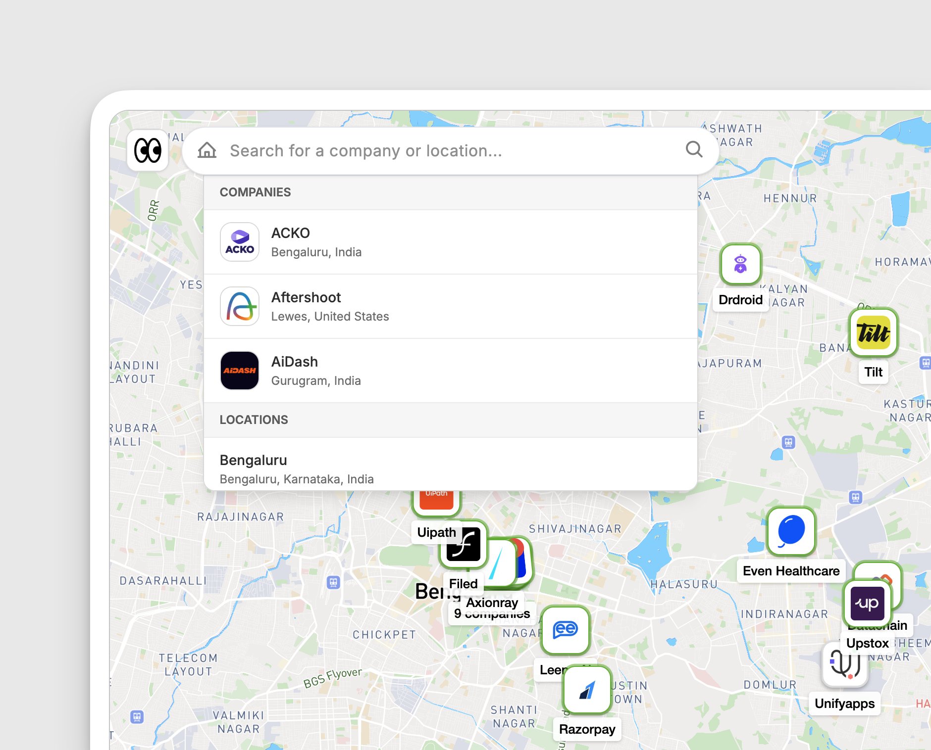
Search companies directly from map
NextDoor.Company
Now you can search companies directly from map with accuracy on search. Clicking takes directly to company marker. Shipping tomorrow.
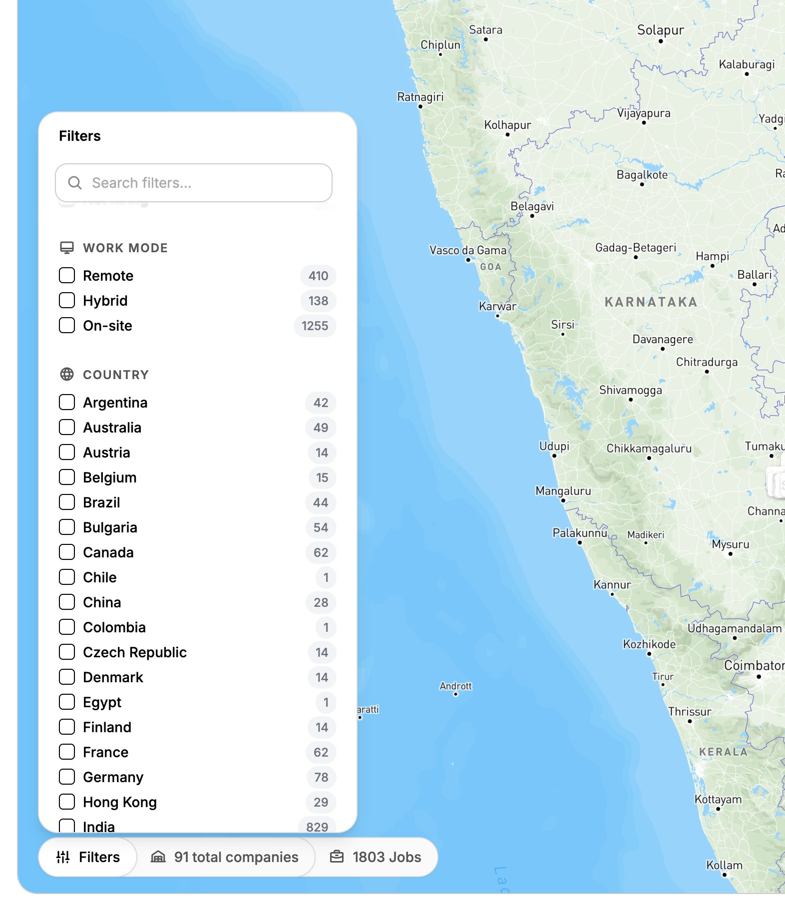
City items in filters
NextDoor.Company
Thanks for the reminder. Adding it to city items in filters on @nextdoorcohq.
1600 plus jobs indexed
NextDoor.Company
Indexed few more startups hiring actively and that makes the total job on the platform to 1600 plus. Cooking a few new company intelligence features. Will share more next week.
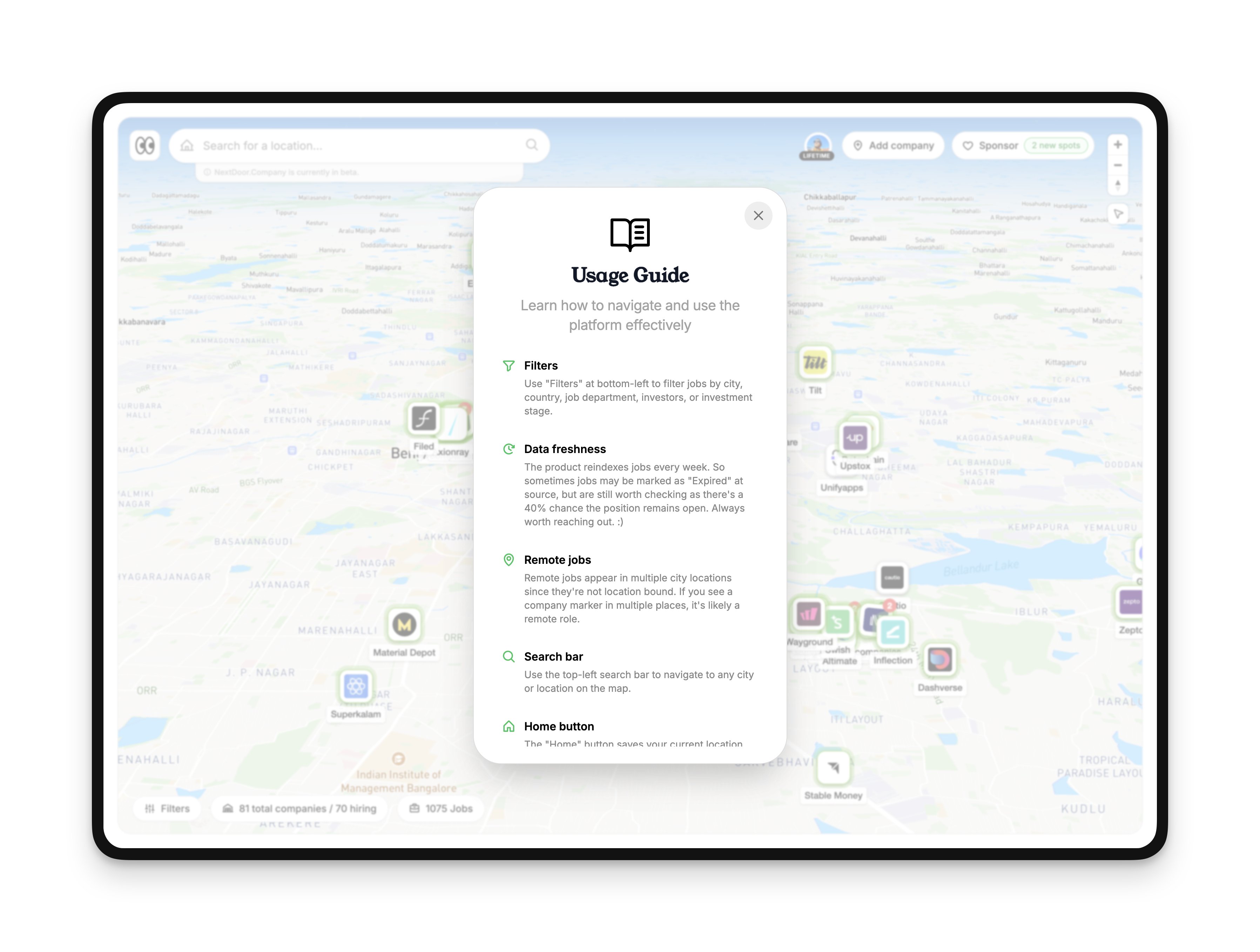
Usage guide for first timers
NextDoor.Company
Add a quick Usage guide during first time sign in. It's not going to take you through all the key CTAs but it's meant to make you aware of how the overall product works. Will watch if this resolves a few queries I've been getting around filters on my WhatsApp DMs.
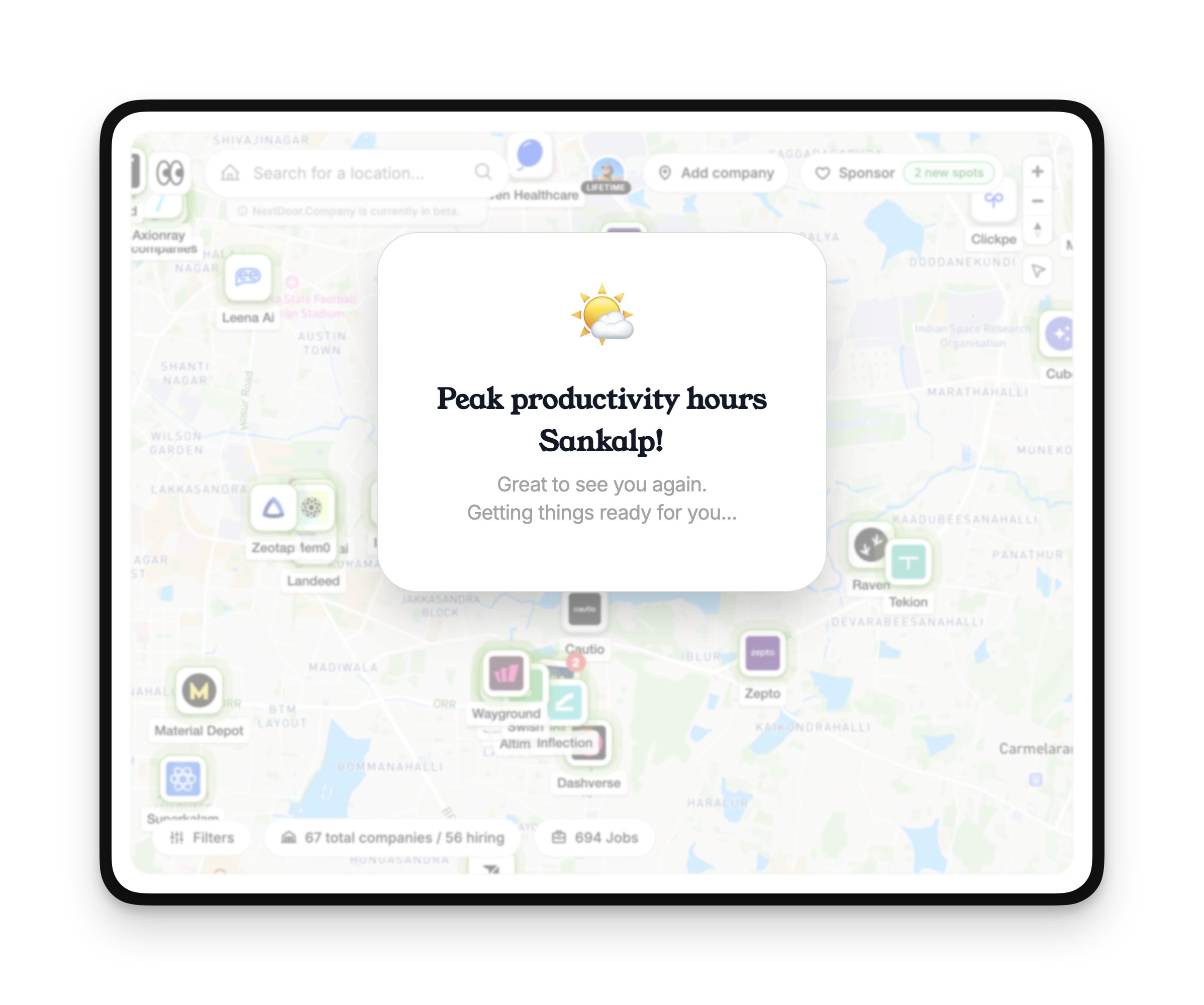
Time based welcome greetings
NextDoor.Company
Added a time-based welcome screen. Reads from your IP and greets you based on the time of the day.
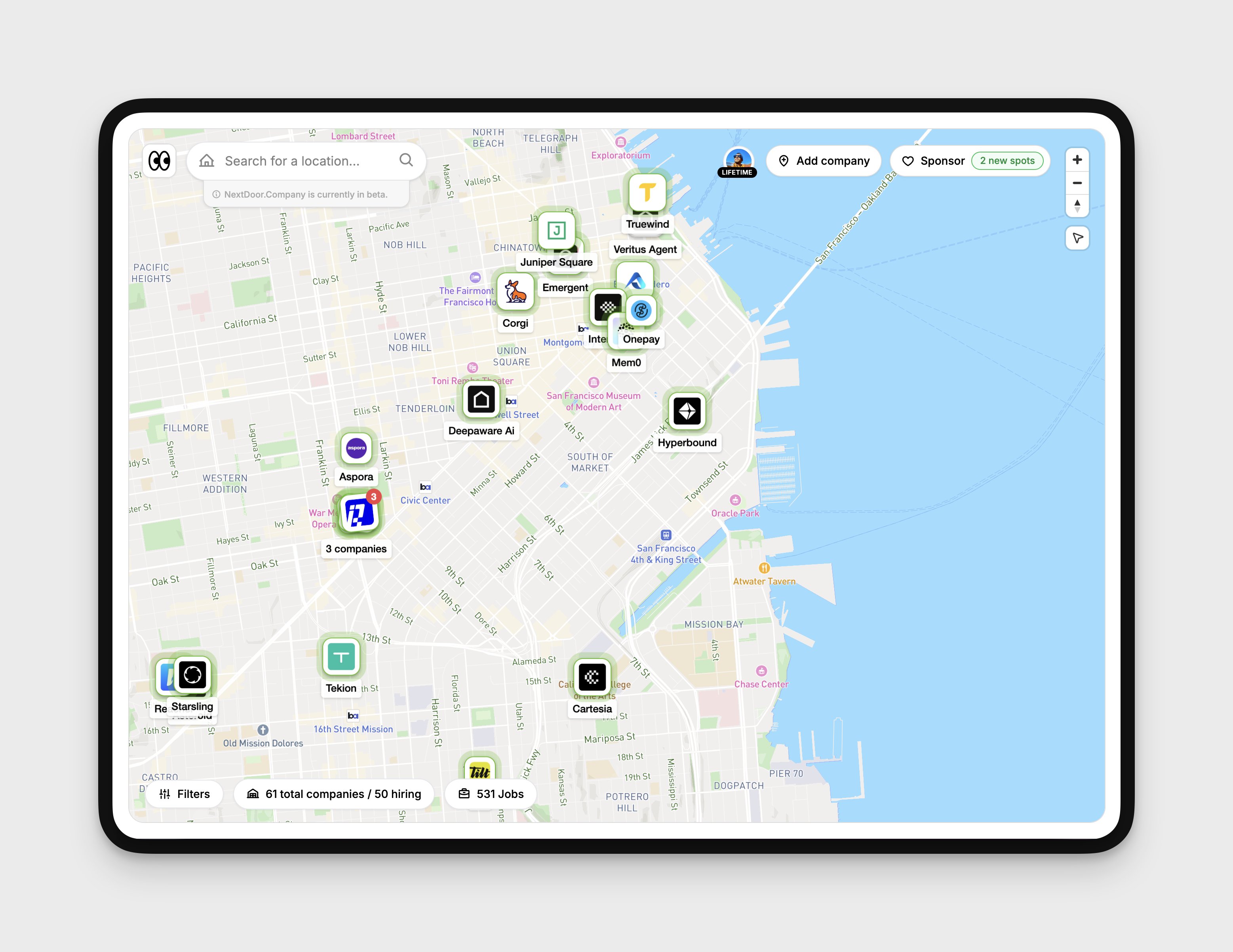
Added 5 more US startups on the map
NextDoor.Company
Added 5 more startups hiring in the U.S. (includes remote, hybrid, and on-site with visa provisions). Proud of the system I've built that allowing me to add more and more cool startups hiring nearby you. More soon!
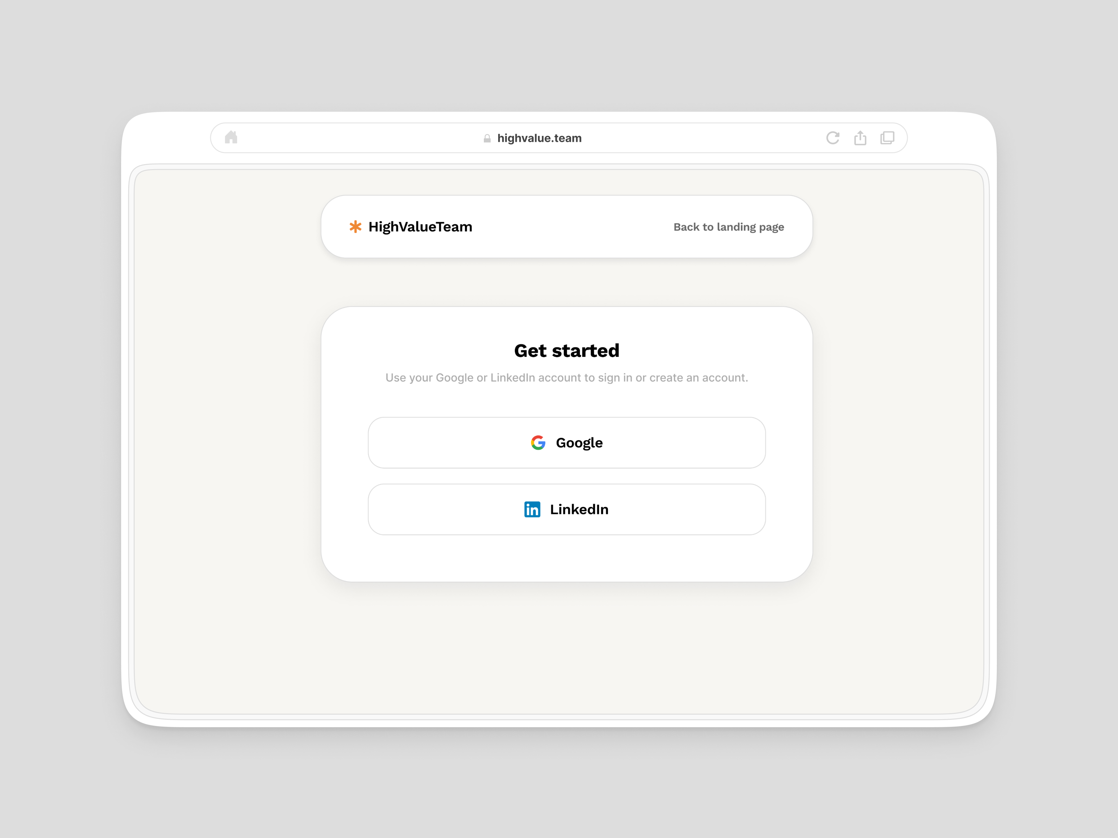
Authentication page
HighValueTeam
Startup time!
HighValueTeam
Quit my $15k+ MRR job this month and jumping full throttle to build something which we (Abhishek, my co-founder and I) believe it must exist in the market for recruiters.
Pivoting Highvalue.Team in a new direction
HighValueTeam
Our new mission is to help recruiters cut down screening time by 80% so they can focus on what matters most i.e. Finding the perfect fit for their team and creating great candidate experiences. We're release v1 sometime in March. If you're a recruiter who's tired of the screening time and the user experience around it, we'd love to show you a much better, easy, helpful and simple way to screen candidates.
Rescanning options
p0
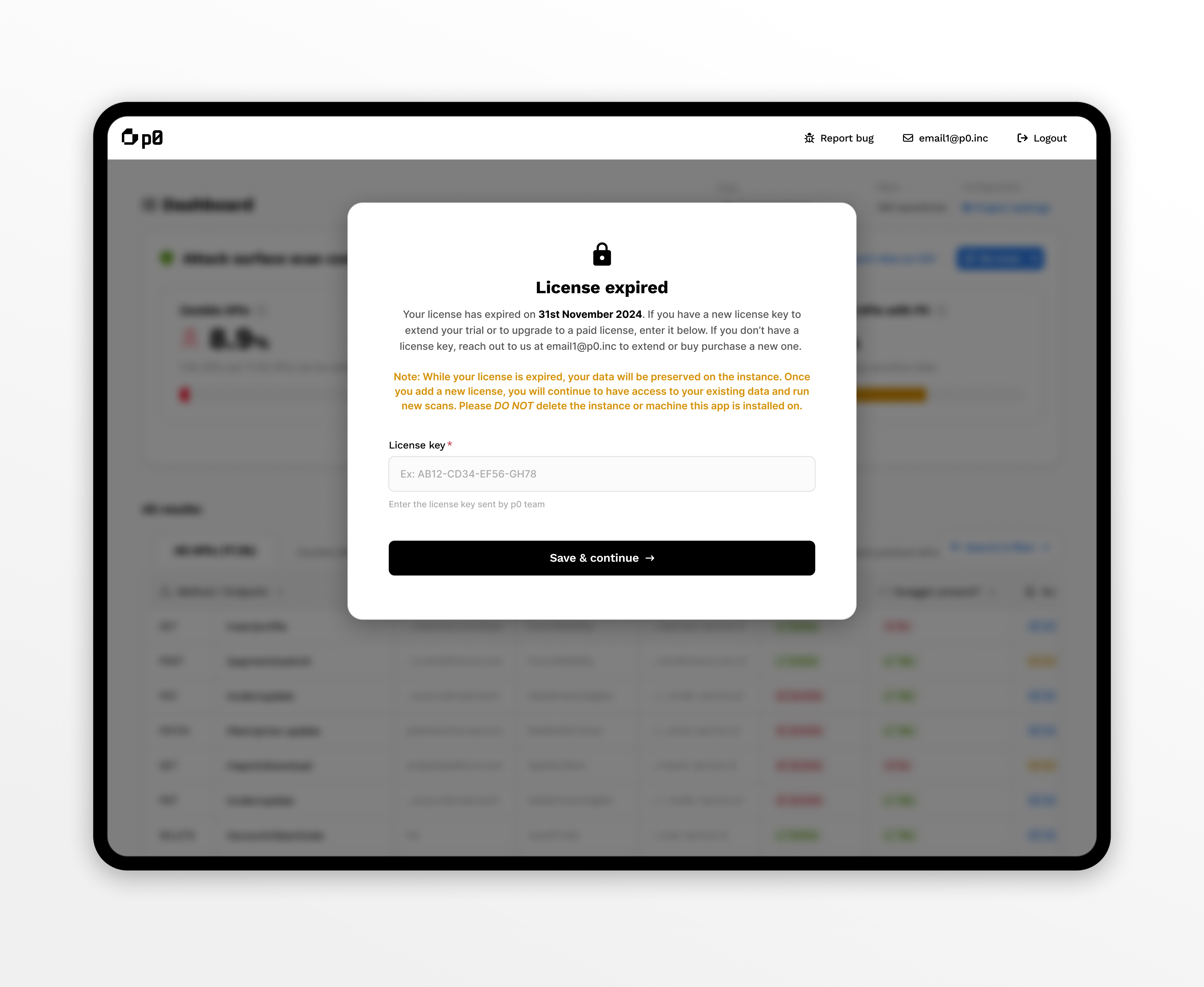
Simple license expired modal
p0
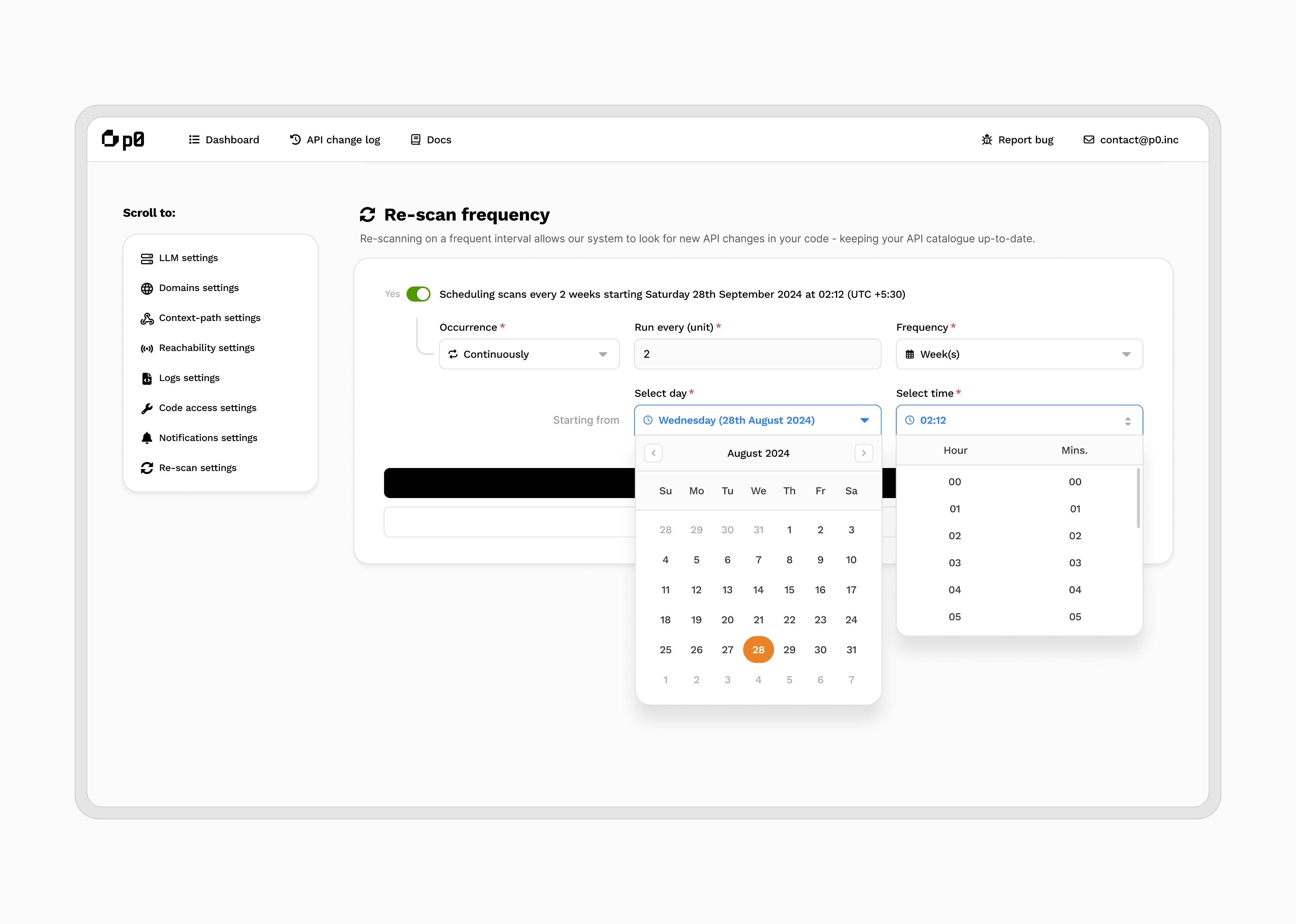
Schedule rescans on your API catalogue
p0
Shipping next: Schedule rescans on your API catalogue on @p0inc
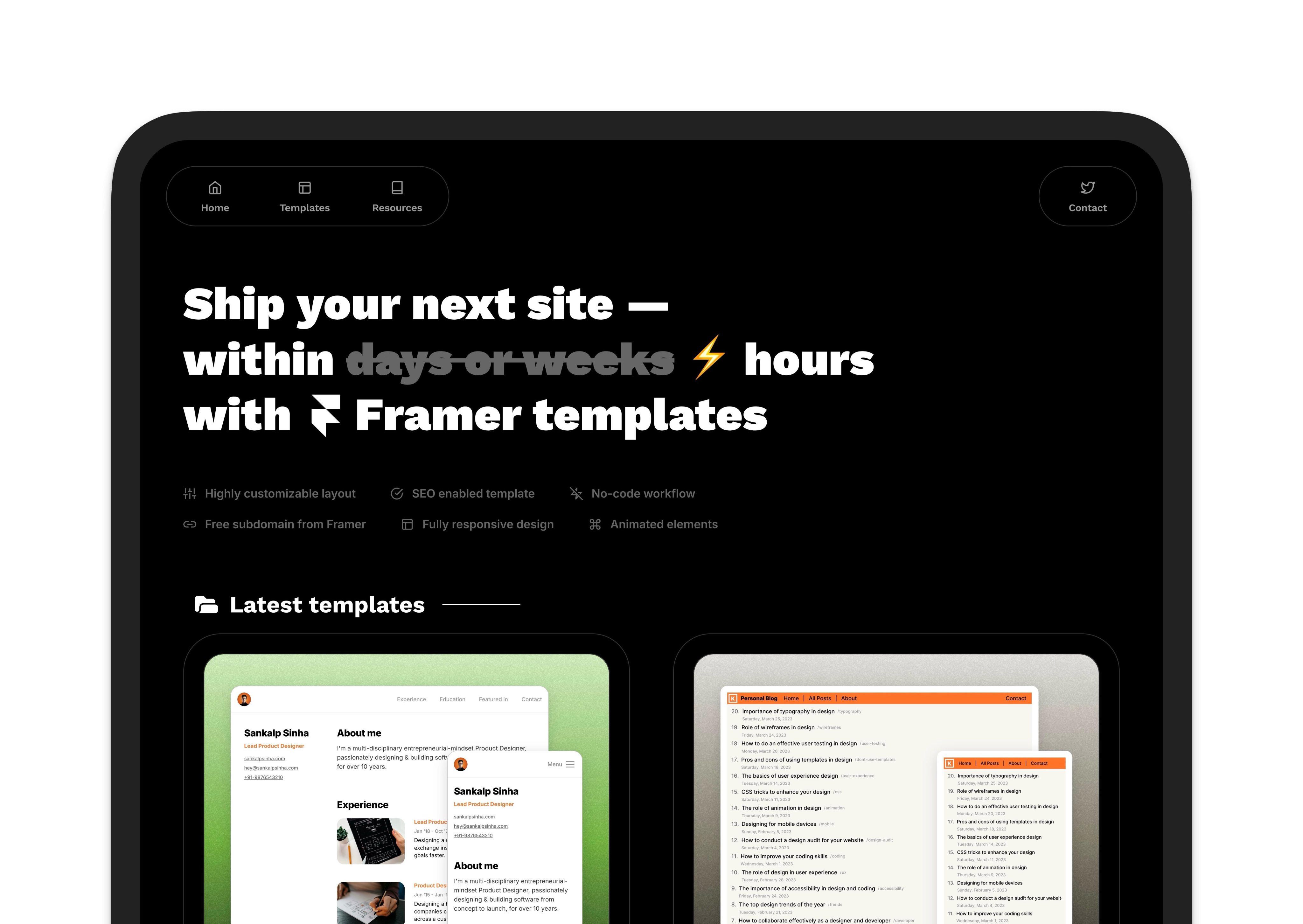
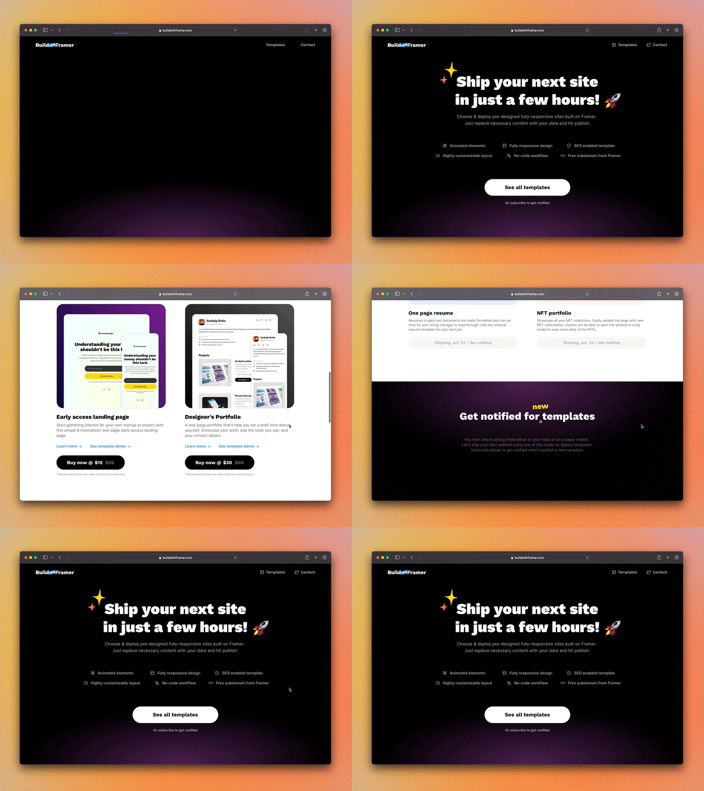
Ship in hours, not weeks
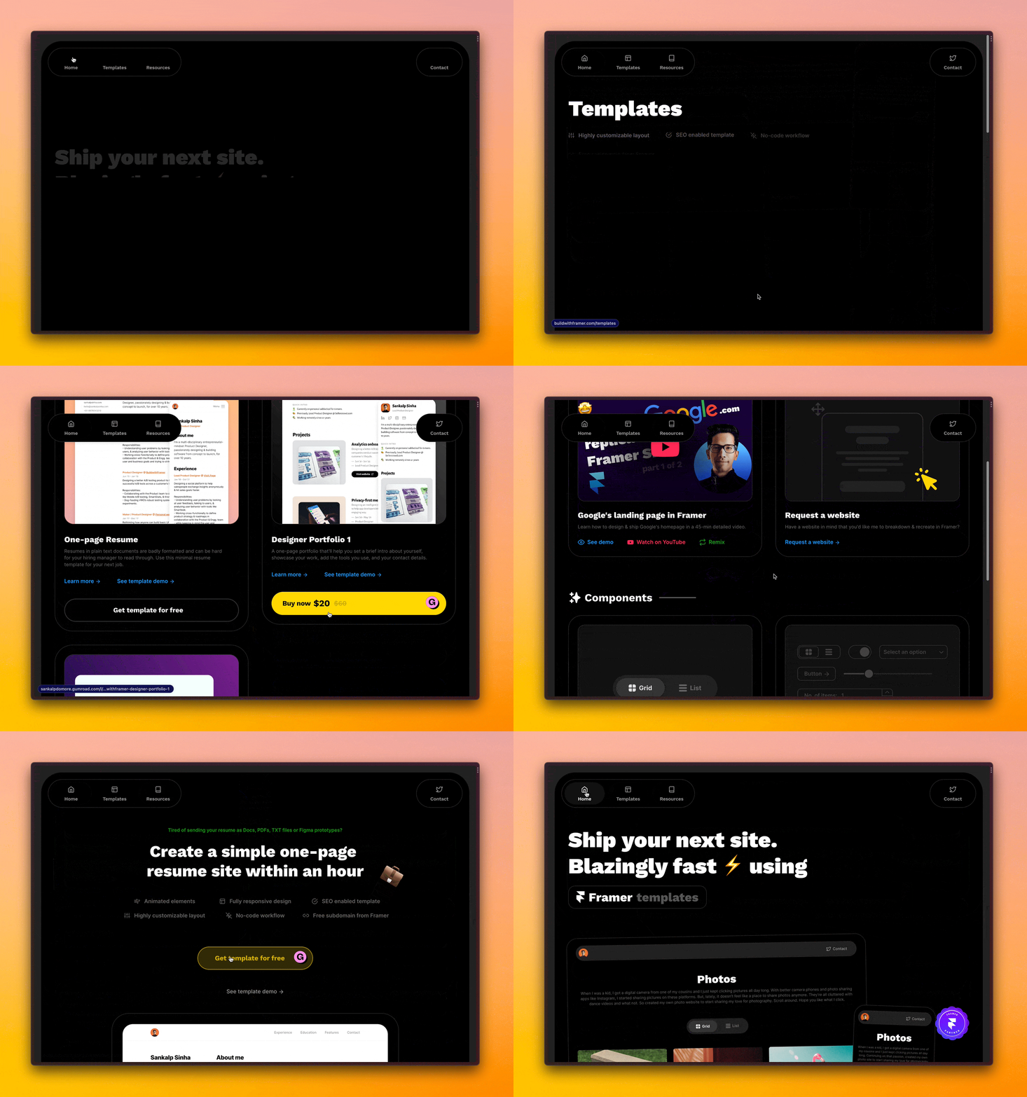
BuildwithFramer
Working on a tiny homepage remodel of my Framer template biz. Back to dropping new mini-templates starting next week.
Projects settings loader
p0
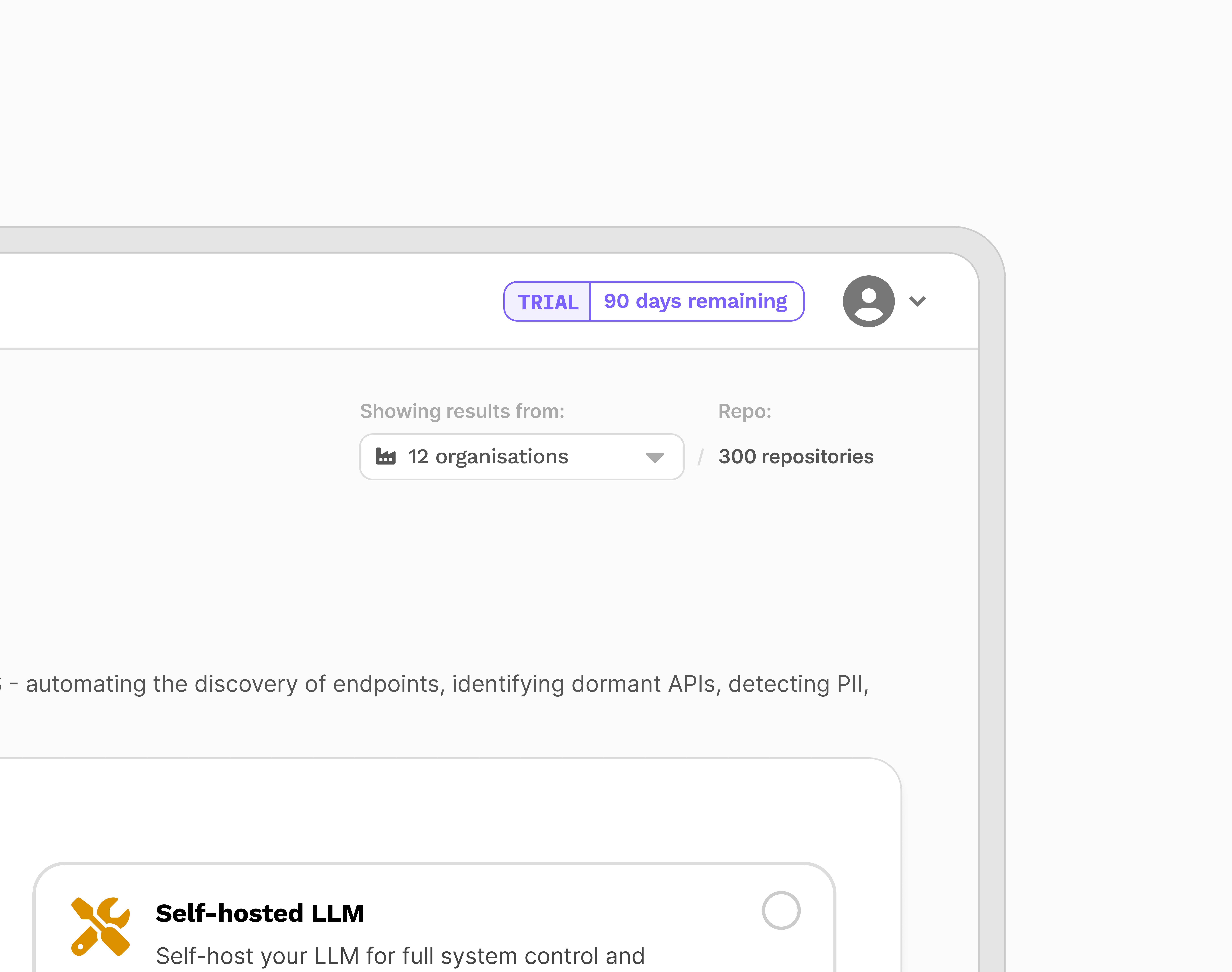
Trial period pills
p0
Light or dark gradient debate
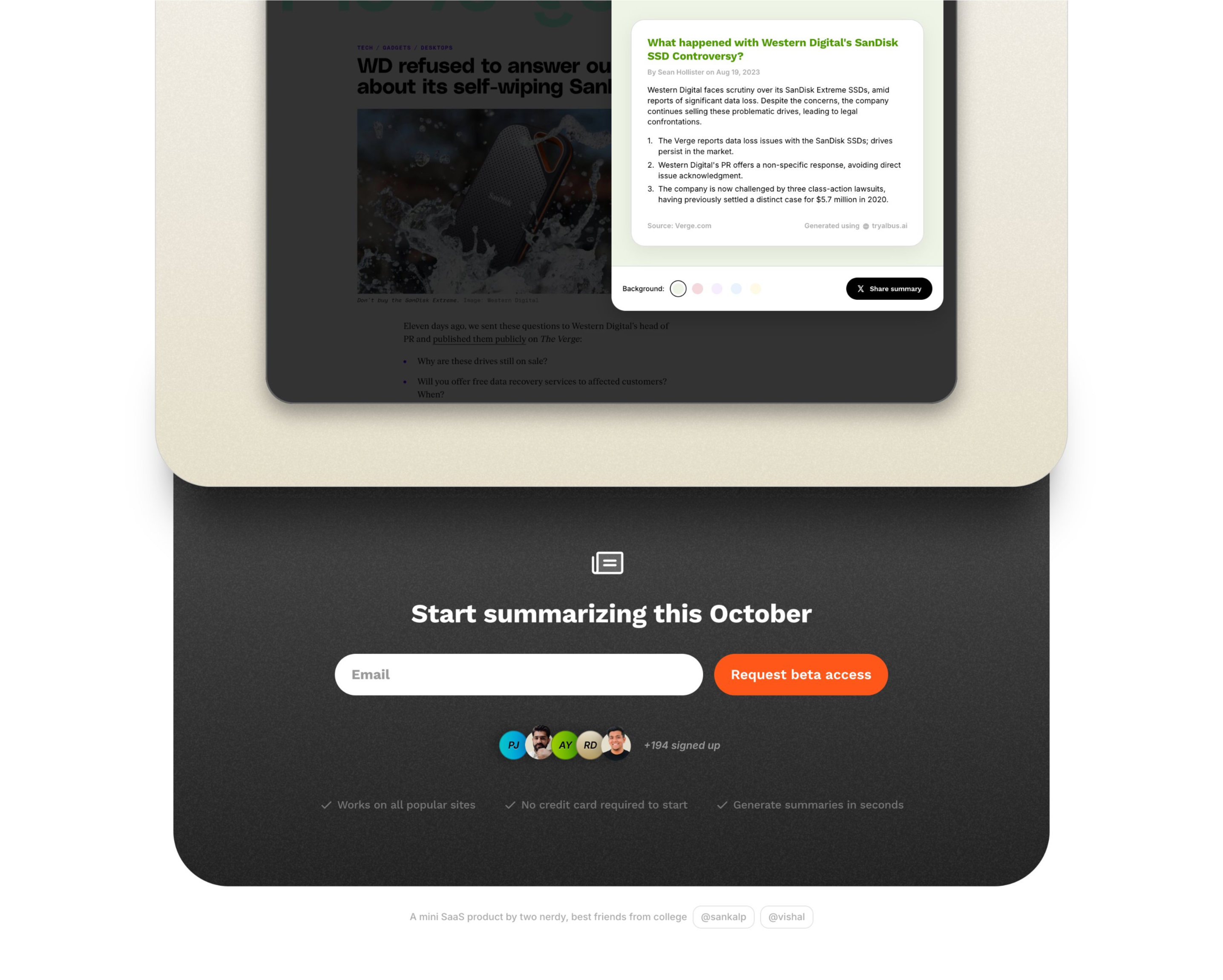
Albus
Help me pick one: Lighter gradient on the form OR darker gradient. A mini SaaS product by two nerdy, best friends from college building a summarization tool.
Road from 0 to 1
p0
Proud of the work I've done at p0 in the last 2 years. We're onboarding big enterprise customers almost every month. Road from 0 to 1 couldn't be more exciting.
Fixing log collection workflow
p0
Since @p0inc is an on-prem solution, getting logs from users have been hard i.e. asking them to download and email. In the next release, we'll fix this by giving them the ability to send it automatically by pressing a button and also being able to inspect it with a copy sent to their email. I didn't want to give the ability to download pre-sending the logs as developers are often itchy about going into the rabbit hole and deviating from the intended use case i.e. send us the error logs so we can debug and fix. An improvement would be to allow them to download the moment they click Report issue - I can handle that with a checkbox near to the CTA which is always checked by default. But for now, this workflow should resolve a lot time wasted in back and forth in getting error logs from our users.
Summary being generated effect
Albus
Getting there! Was able to customize the appear effect with multiple level of components to get this summary being generated effect in @framer in about 1 hr. Now just need to replicate this for all the tabs and logos so their content renders on click. Looking good to beta launch this in October I guess.
Custom tags for APIs
p0
Next week update for @p0inc: We're shipping the ability to tag your APIs with custom values soon. While we categorise APIs in multiple categories and filters -- this release is going to help security teams categorise APIs further based on their org-specific context.
Is this too fast?
Albus
Testing different appear effect for tryalbus.ai launch site - think this is too fast?
Design systems for speed
p0
Unpopular opinion: If you're an early stage startup and are a single designer running design, spend some extra time and effort setting up a design system. It makes a huge difference in speed while playing with ideas during design sprints and allows you to set a tone for your product; reducing design and FE debt later on. This advice is definitely not for everyone. If you enjoy building and working with design systems and you can convince the business on its benefits - it's def. worth the extra time and effort. From my current design sprint of figuring out a combination of search and filters UX for @p0inc users.
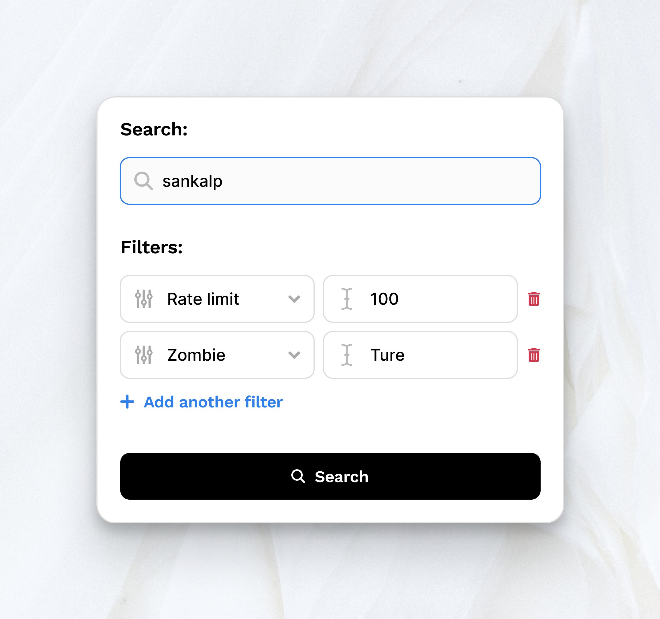
Search and filter through thousands of APIs
p0
Testing a quick search and filter UX today for @p0inc to help users search and filter through thousands of APIs in their system.
Albus formatting on popular sites
Albus
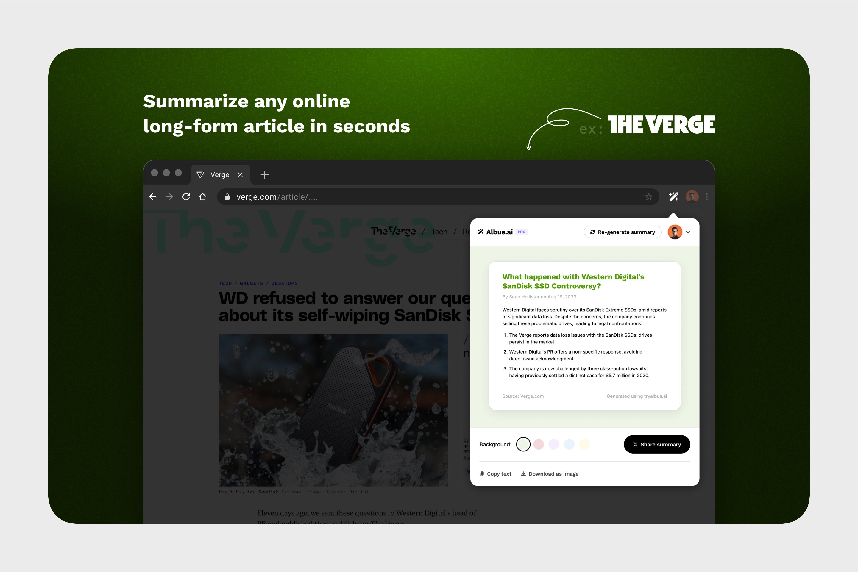
Was testing a few screenshots to demo tryalbus.ai's capabilities last weekend. Here some mocks depicting what Albus's formatting will look like when executed on popular sites like Verge, The Guardian, HackerNews, Reddit, or even a Twitter thread.
New blog system in Framer for p0
p0
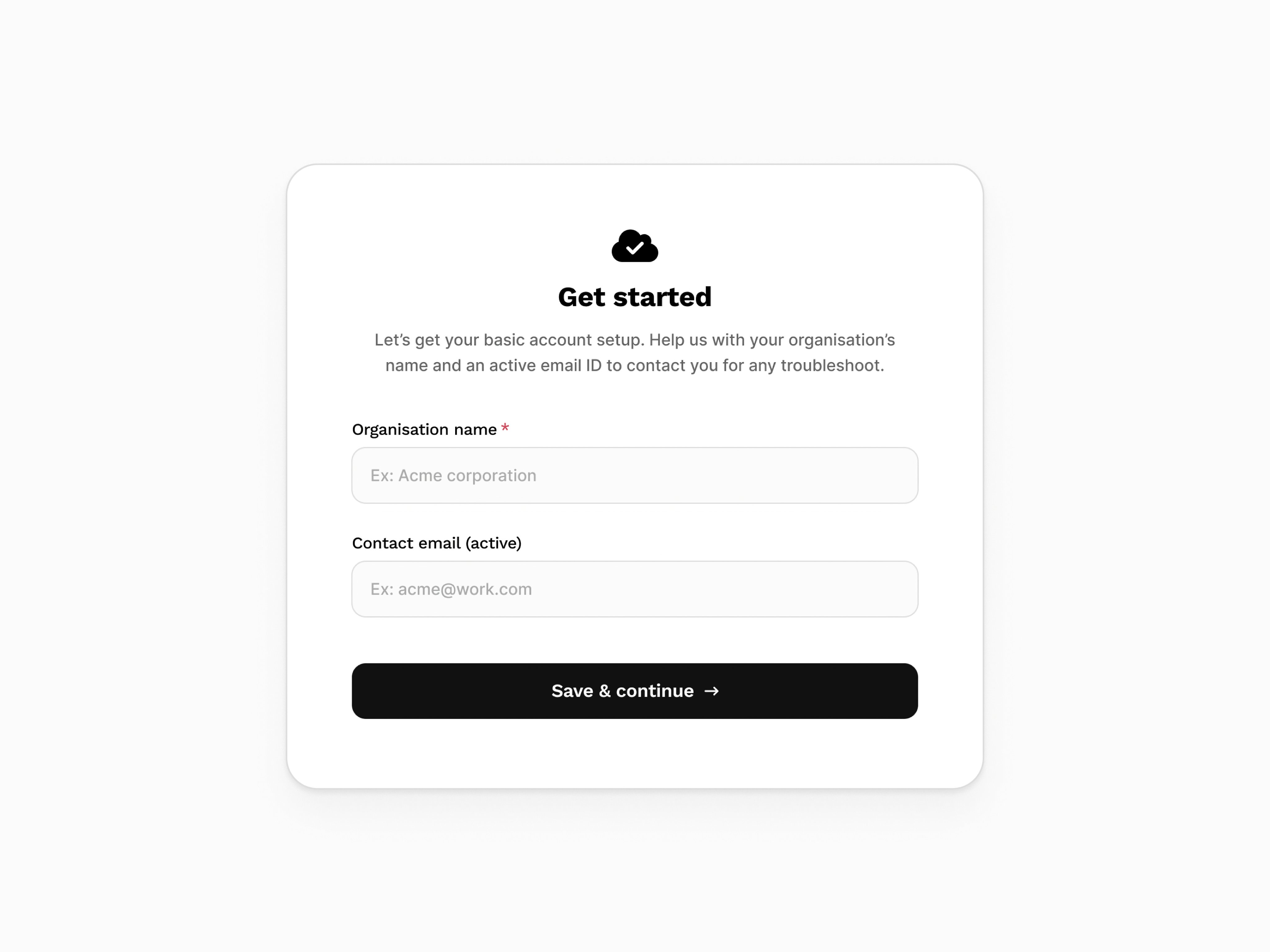
Post on-prem installation 'Get Started' page
p0
Simple intro page for Albus
p0
Got domain for another side project: tryalbus.ai - Which will be a summarization tool to summarize articles in secs with 1-click - to be digested or shared online. Ideal users are social media marketers who share summaries of their company's blog posts to drive engagement and individuals who read a ton online but are crunch on time.
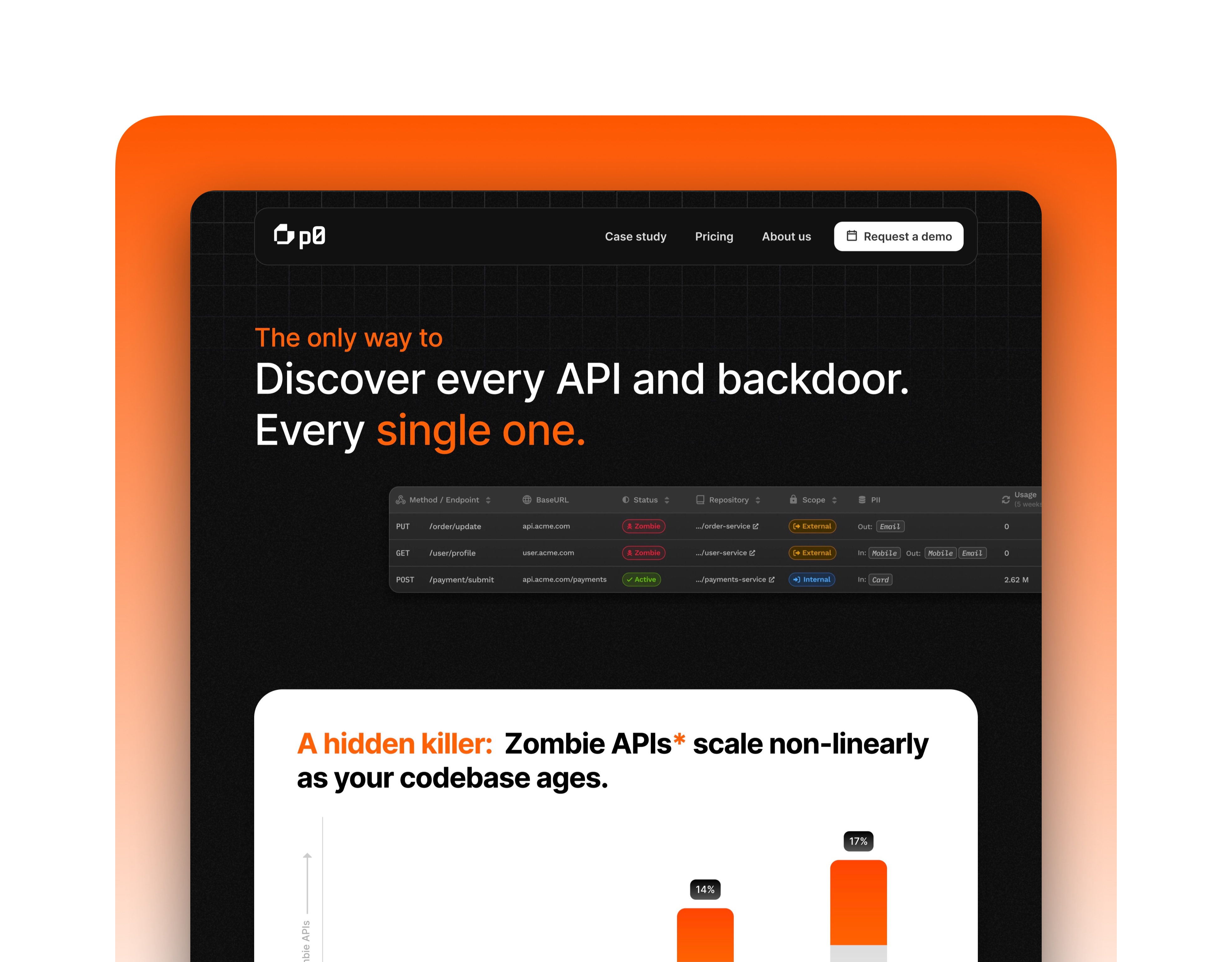
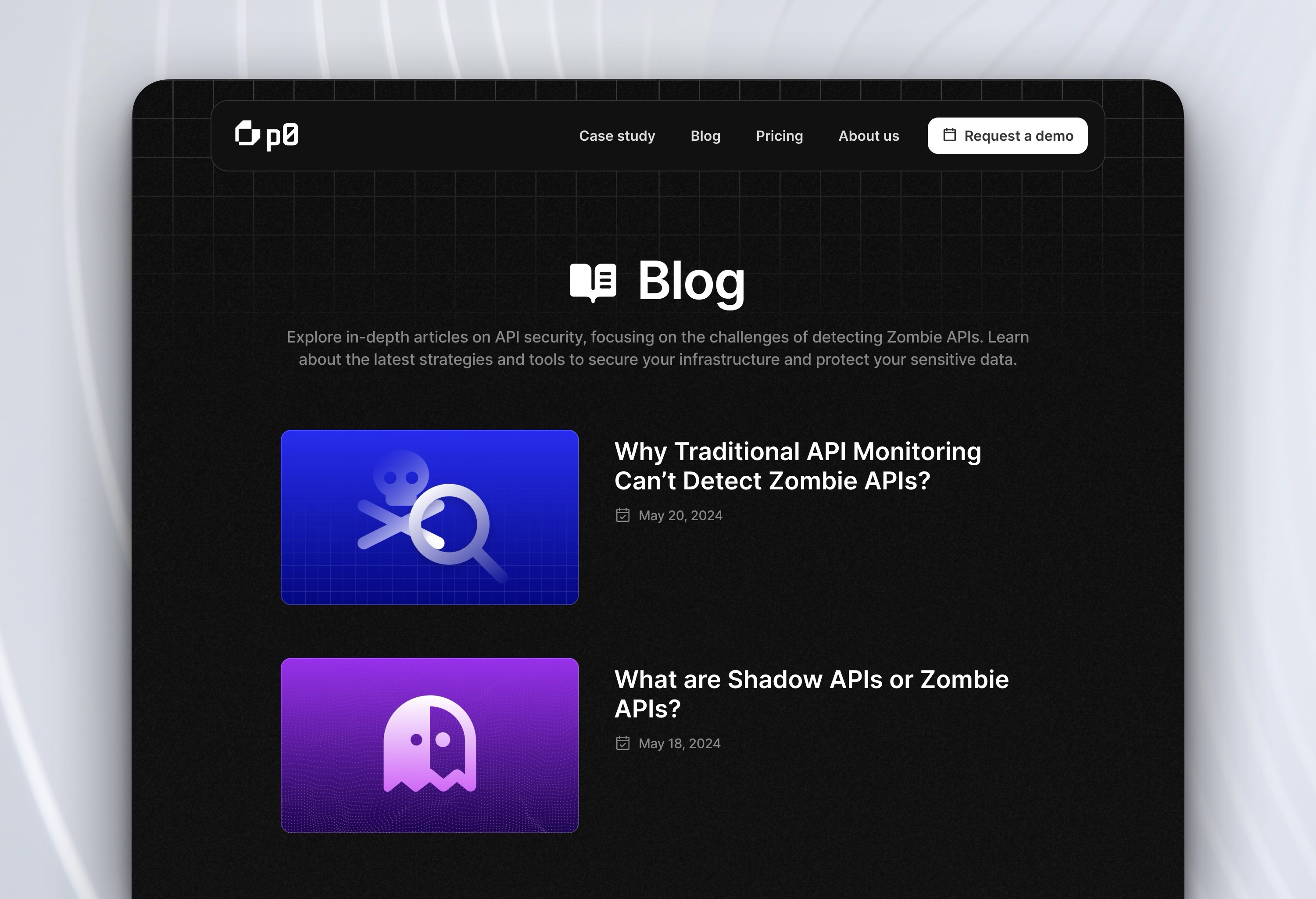
Why care about Zombie APIs section exploration
p0
Another WIP section from p0's new landing page. Few pointers: 1.Both these sections addresses the WHY of the business 2.First section which is kind of a 4 reasons of Why an enterprise business should care about zombie APIs. Wanted to keep it simple & crisp so no product screenshot in this version. 3.The second section, although is another WHY, but it's more of a social proof i.e. see the research paper on zombie APIs and the damage they've caused in the past. Improvements here and to try in the next iteration: a. Add some product screenshots in the 'Why care' section or relevant illustrations b. Add a CTA to request a demo at the end c. Try adding additional social proof in terms of # of downloads in the whitepaper section right below the CTA to see if it drives users to download them? Not sure. Anyway, more soon. We're targeting to release the new landing page probably next week. BTW, the whitepaper card looks cool IMO. Framer's scroll transition for the win.
Early landing page exploration for p0
p0
Idea was to demonstrate p0 finding Zombie APIs in your system. We didn't implement this as this looked too generic and didn't communicate the idea effectively.
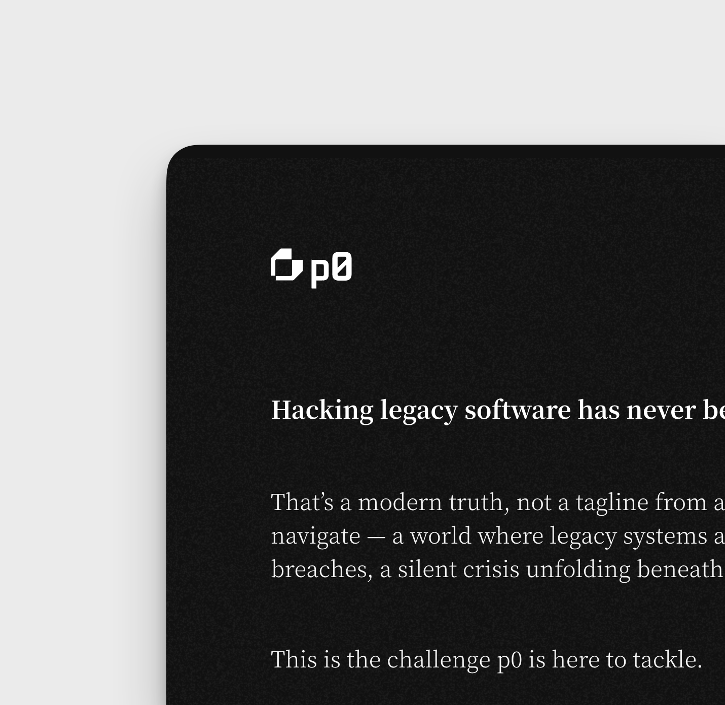
Intro section from letter from the founder
p0
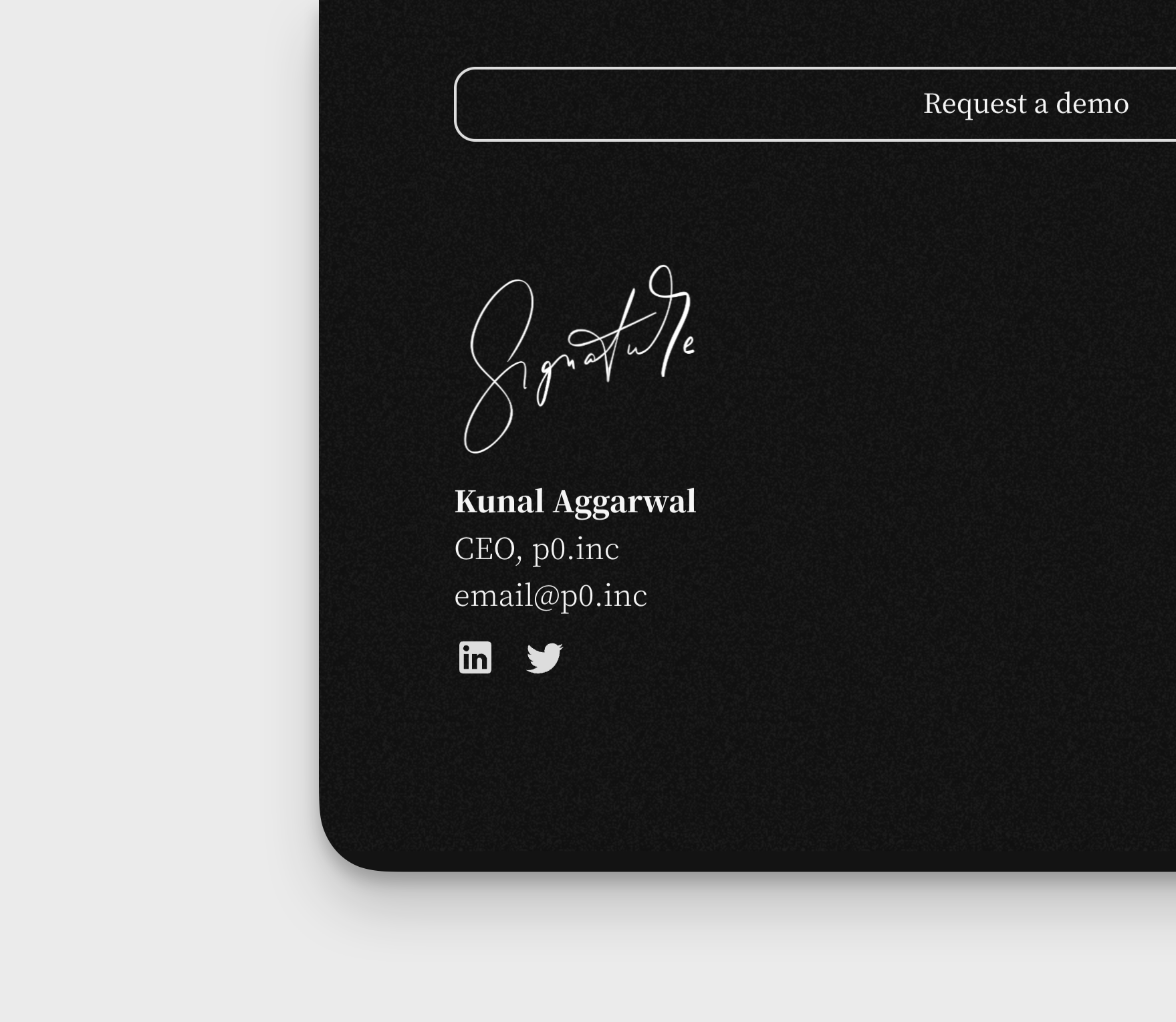
Footer section from letter from the founder
p0
Footer signature from a `letter from the founder` type landing page exploration I did for p0.inc earlier this year
p0 landing intro
p0
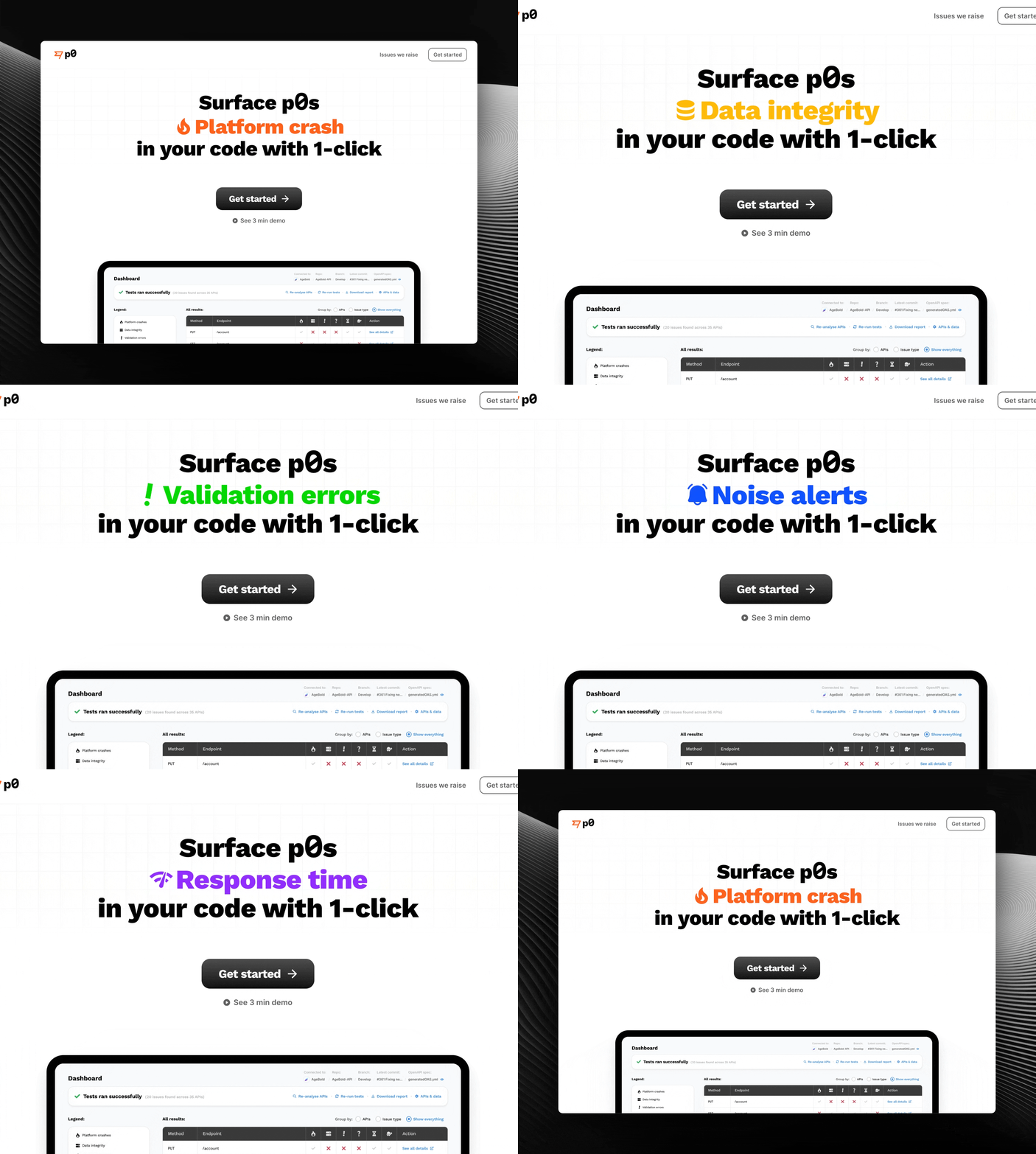
In 2022, we pivoted from serving testing needs in web3 to web2 and attacking the API testing space after conducting multiple user interviews with engg. leaders. We found that every once in a while, tech teams get embarrassed because of a 'Something went wrong' or an 'Unknown error' during a demo - or worst case, when a user is trying to use their product and have already paid for it. With p0, we're going to help teams catch these issues before they go into production. All they have to do is give access to their staging server and test their APIs with p0 and we do the rest. To convey this message as simply and clearly, I put together a quick landing page demonstrating what this tool can do for its users last year in August. Rationale for this intro section direction was: Has to be easy to understand, has to be short so it’s not too wordy and loosing essence, and we’re in pre-beta and in a 0 → 1 journey so want to only show to users who have this pain sharply identified in their org. For that, a quick personalized demo is the way vs. an open ended inbound kind of landing page. A quite tease of the app’s dashboard to: Tease & nudge the viewer to scroll down.
Landing page section
HighValueTeam
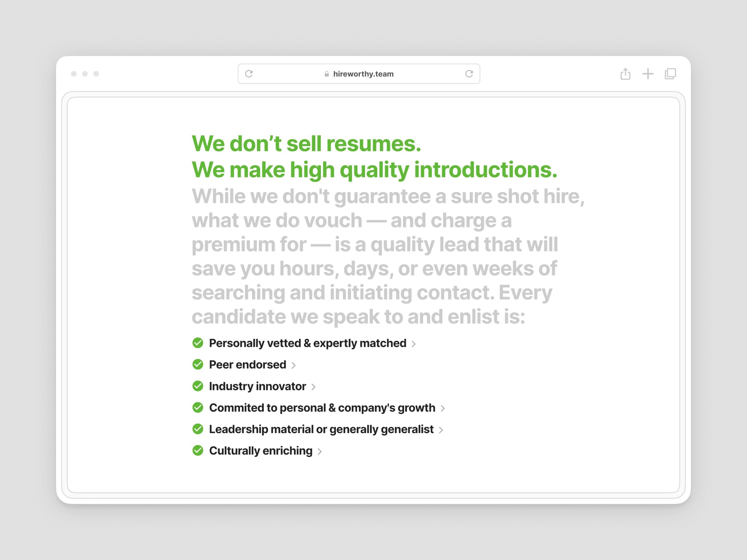
We believe that being introduced to the best tech talent in India should be as easy as making a single phone call. That's why I'm creating hireworthy.team with two of my highly technical and experienced recruiter friends. We're in the process of ironing out a few details, but it looks like we'll be ready to launch by mid-January. In the meantime, I wanted to share a snippet from our landing page that highlights the focus of this venture. We're not interested in just selling resumes; there are plenty of those services in the market. We understand that time is money for startup founders. They're looking for high-quality leads to engage with. I've heard it countless times: founders appreciate a conversation with a highly skilled and professional candidate, even if they don't end up hiring them. They look forward to staying in touch and finding other ways to collaborate in the future. That's the rationale behind assembling a pool of high-quality tech talent and introducing them to busy founders and startups—it's immensely valuable. Excited to be building this on the side. Will unfold more on our guiding principles about Hireworthy with a few design shots every week. However, if your hiring needs are urgent and you value high-quality introductions, please feel free to send an email (details on our website).
Coming soon section
HighValueTeam
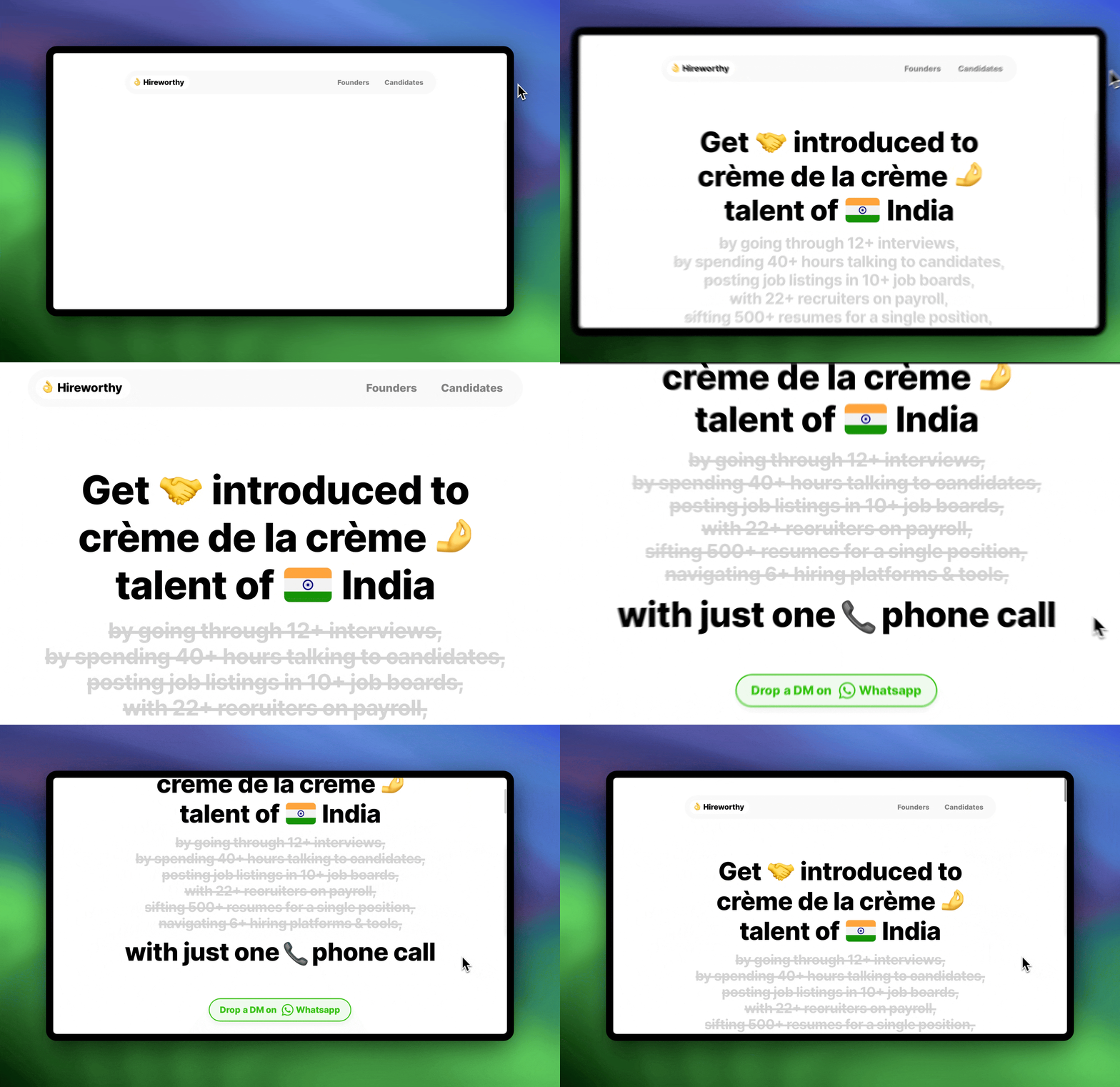
Bought a new domain last week 👀 We think getting introduced to THE BEST tech talent for founders (in India) should be as easy as one phone call. Going to be building this on the side with two of my close recruiter friends 🙌 More soon!!
Bye Ghost, hello custom code
Personal website
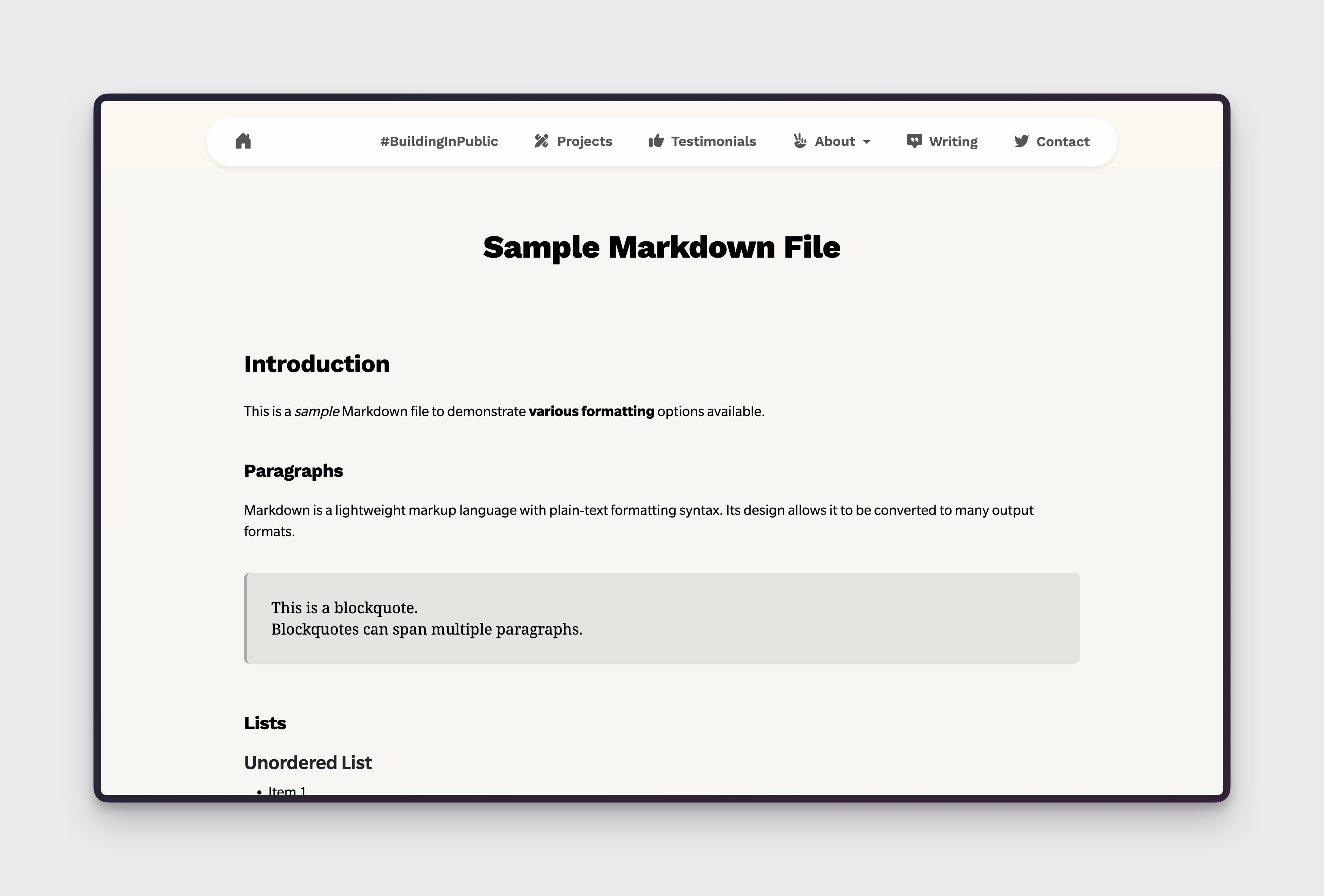
Bye Ghost. Hello custom code. My current blog design sucks as it's on Ghost and I didn't want to touch the theming on Ghost since I design and maintain my own styling for my personal site. Finally took some time out yesterday and got GPT to get me a blog CMS ready in 1 hour in Angular. Going to be styling it a bit more according my site's theme and port old content. New custom blog with markdown pages coming this month.
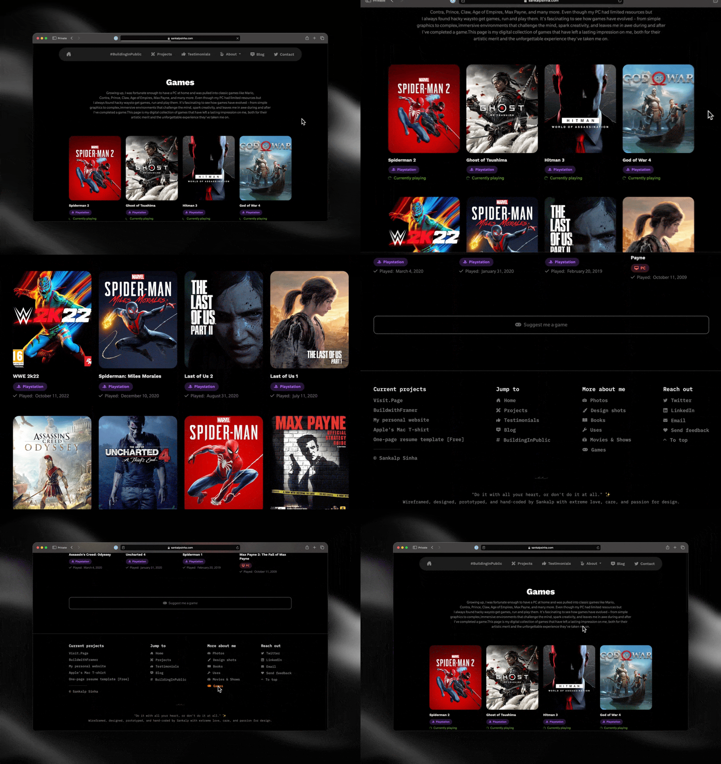
Games page
Personal website
Using the same grid structure that I've been using for movies, books, and uses page on my site, duplicated the code last year and populated it with the games I've played so far and currently playing. Will be catelouging more here from the past but it's a good start.
Illustration exploration for p0 landing
p0
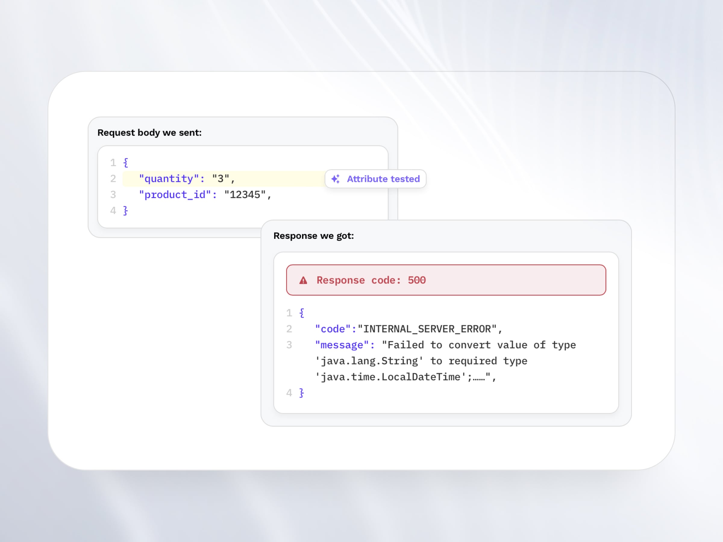
In 2022, we pivoted from serving testing needs in web3 to web2 and attacking the API testing space after conducting multiple user interviews with engg. leaders. Every once in a while, tech teams get embarrassed because of a 'Something went wrong' or an 'Unknown error' during a demo - or worst case, when a user is trying to use their product and have already paid for it. With p0, we're going to help teams catch these issues before they go into production. All they have to do is give access to their staging server and test their APIs with p0 and we do the rest. The landing page has a section explaining the types of issues p0 can raise in user's endpoints (APIs) and how we're able to do that. This illustration was done to demonstrate how users can prevent platform crashes by using our tool to generate real life cases to test endpoints that can result in platform crashes.
Payload source pills
p0
Early TryAlbus.ai landing page
Albus
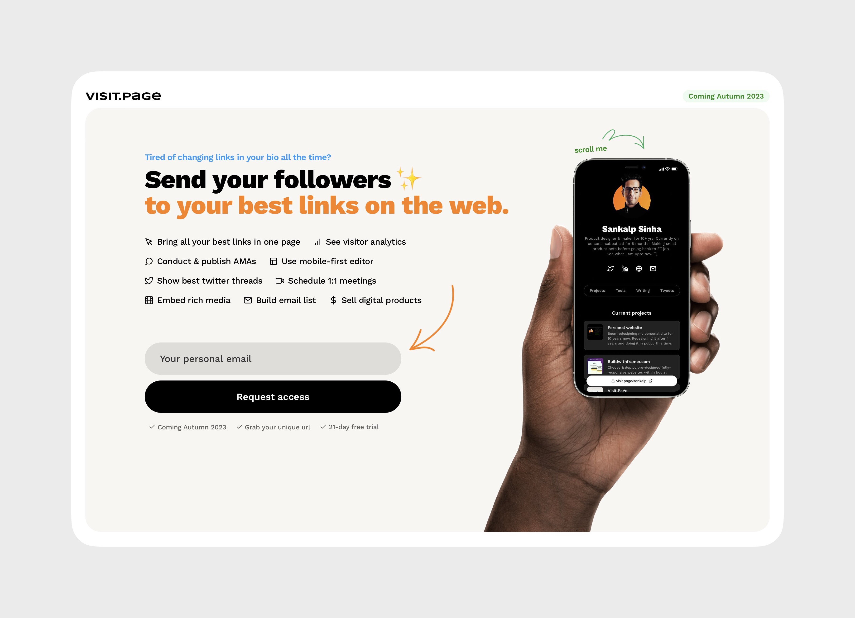
Landing page for a side project Visit.Page
Visit.Page
Loading state for photos page
Personal website
Design shots page
Personal website
Discontinued my Dribbble pro account and shipped this Design Shots page on my website today as a tracker for my WIP or finalized design work. This is inline with having control over my data vs. relying on a 3rd party tool like Dribbble or Behance or whatever comes next.
Project redesign
BuildwithFramer
Released a fresh look of my BuildwithFramer project. This re-design is a result of many weekends and nights of design details. Includes New templates page, New resources page, and all that powered by Framer CMS
Uses page
Personal website
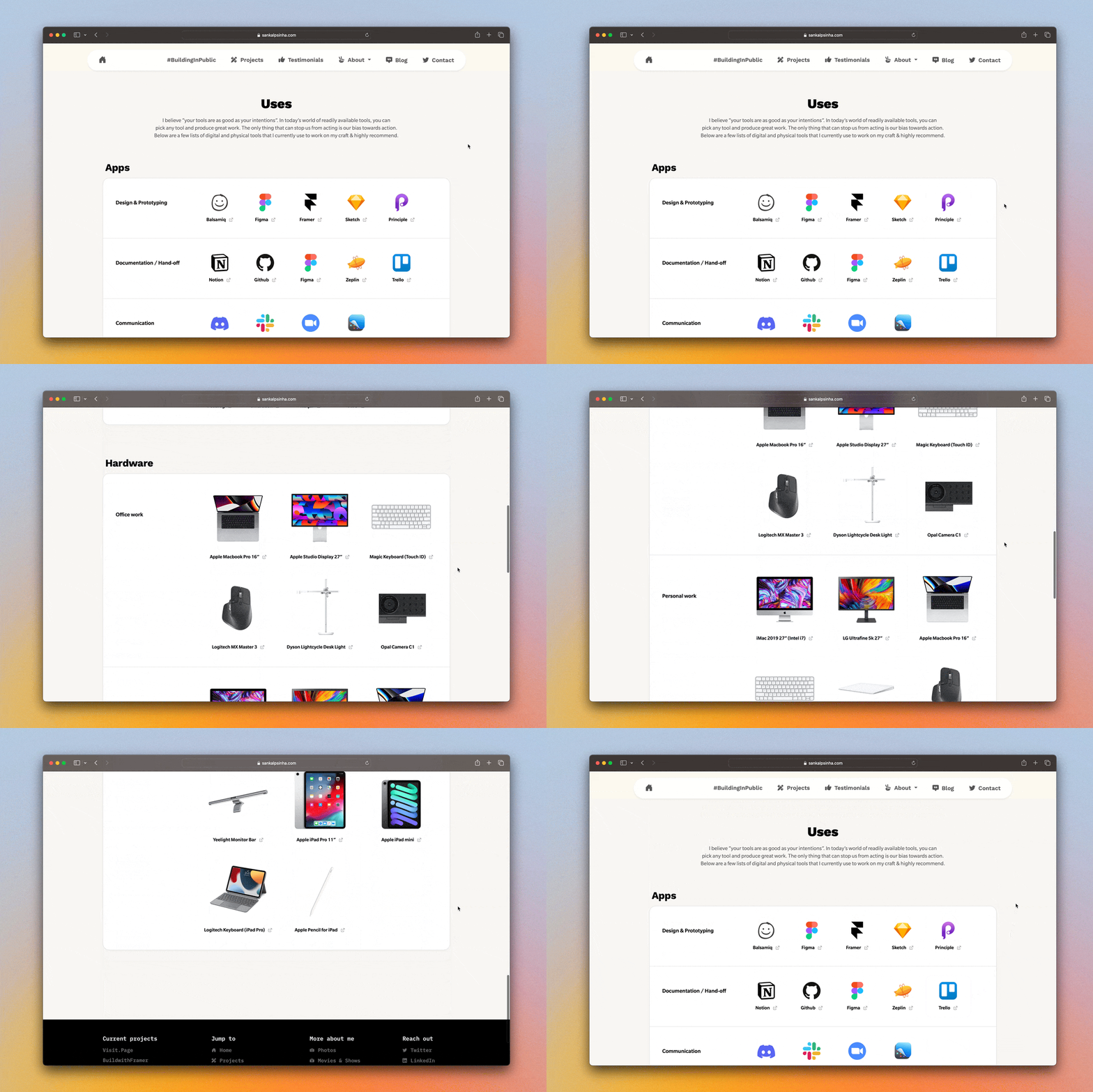
Finished coding the Uses page for my personal site. It lists all the software and hardware I use, categorized into sections for designing, documentation, communication, website development, and user analysis. The hardware section is currently divided into personal and office work. Both sections will expand as I add more tools and categories. As always, the goal is to ship something quickly and keep building on top of it.
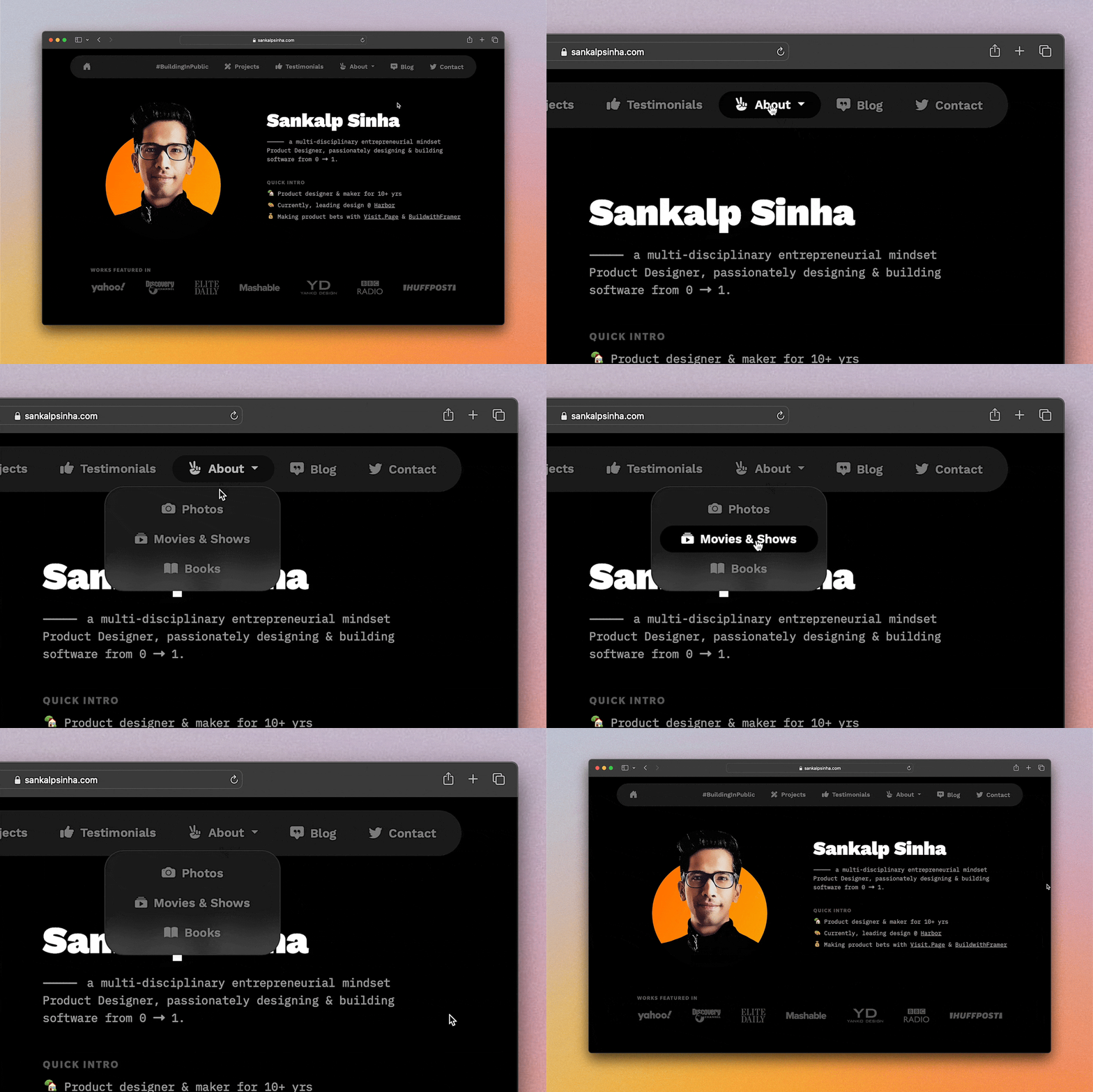
About dropdown menu
Personal website
Like most people, I never liked reading books for school or college. Interestingly, my dad is a writer and keen reader. I grew up around books, and I've always been interested in reading them. I started reading self-help books on productivity, design, business, marketing, and work-life balance when I went to college. In an attempt to capture the books I've read so far, I designed and coded this page last weekend.
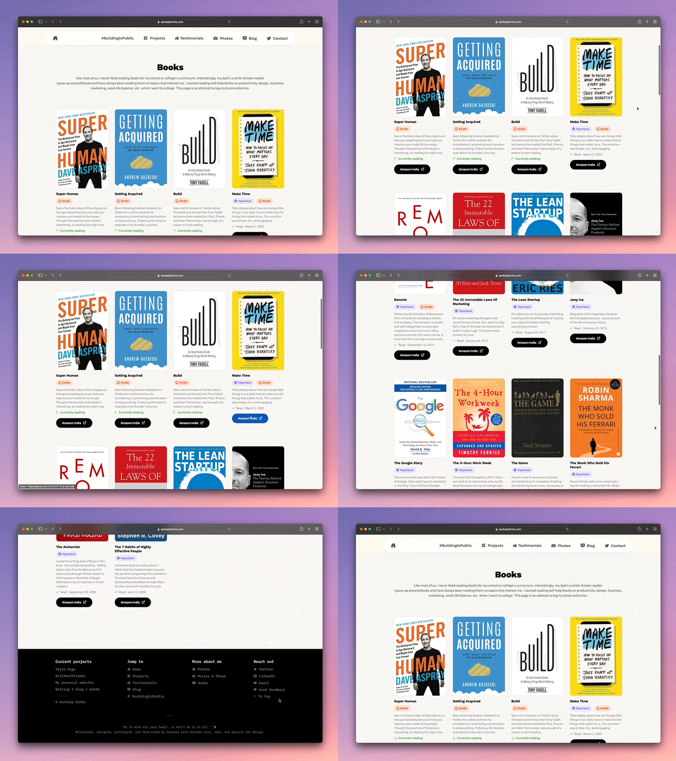
Books page
Personal website
Like most of us, I never liked reading books for my school or college's curriculum. Interestingly, my dad's a writer & keen reader. I grew up around books and have always been reading them on topics that interest me. I started reading self-help books on productivity, design, business, marketing, work-life balance, etc. when I went to college. In an attempt to capture books I've read so far, designed & coded this page last weekend.
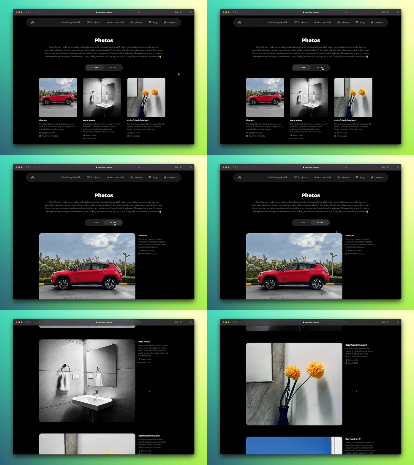
Photos page view toggle
Personal website
During my 6-month sabbatical, I launched a photos page on my personal website to overcome Instagram's limitations and enjoy greater control over my photography. The initial grid view worked, but I desired a larger viewing format. Modals weren't the answer – they hampered photo transition and demanded extra coding. I opted for a 'List' view instead, presenting my pictures in a single-column layout ideal for larger screens.
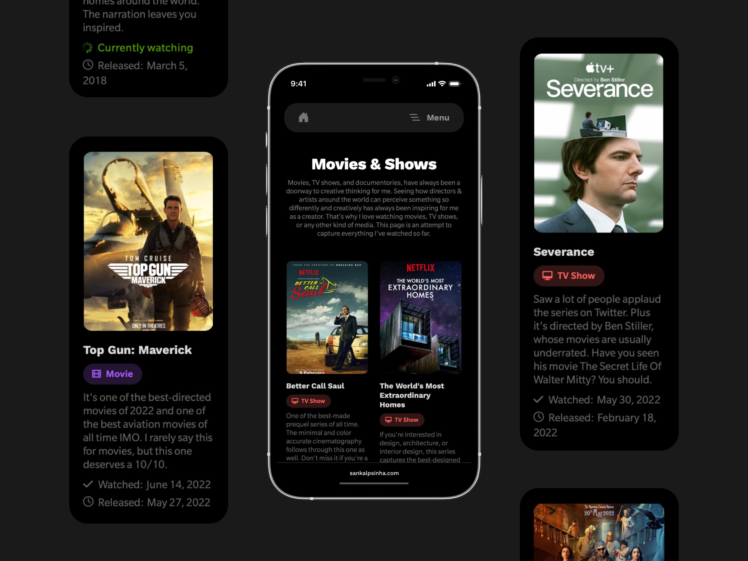
Mobile view of movies page
Personal website
Movies, TV shows, and documentaries have always been a doorway to creative thinking for me. Seeing how directors and artists around the world perceive something so differently and creatively is truly inspiring for me as a creator. That's why I love watching any kind of media. In an attempt to catalogue everything I've watched so far, I designed and coded this page over the weekend.
Landing page V2
BuildwithFramer
I took a sabbatical last year (early 2022) to build my personal website. While building mine, I researched other designers' websites and realized many don't have one due to lack of time, energy, and infrastructure. This sparked the idea to release a portfolio template using Framer, a decision that aligned perfectly with Framer's new product pivot. I shared this concept via a tweet, which generated a ton of positive feedback. I worked on a simple landing page and the template, which I'm refreshing this weekend. Excited to release the new landing page today!
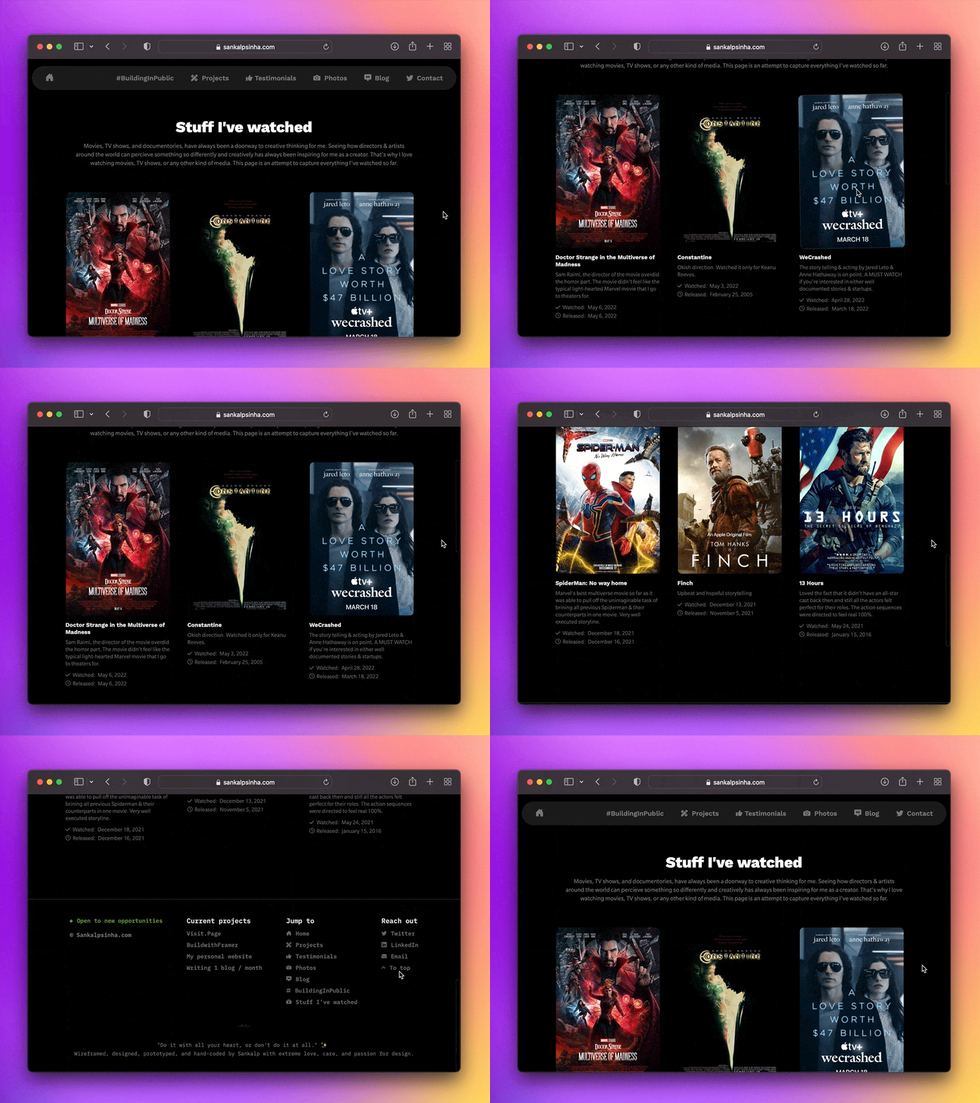
Movies page
Personal website
Movies, TV shows, and documentaries have always been a doorway to creative thinking for me. Seeing how directors and artists around the world perceive something so differently and creatively is truly inspiring for me as a creator. That's why I love watching any kind of media. In an attempt to catalogue everything I've watched so far, I designed and coded this page over the weekend.
Personal photo site is now mobile responsive
Personal website
Made the photos page responsive that I shipped late last year.
Personal photo site
Personal website
I shipped my own photos page early last year. Why, you may ask? It's because I hated what Instagram has become lately. My data was owned by FB. With my personal photo page, I own my data. It's all for the pure love of photography and giving my photos a permanent place on the web.
BuildinginPublic page is now mobile responsive
Personal website
Pushed another update for my BuildingInPublic page. The intention here is to get this page to its true essence of building in public. So, making a ton of assets public for this redesign project. + When you visit the BuildingInPublic page from your smartphone, you'll be able to view the Figma files and Github activity. Spent some time yesterday to make them responsive.
